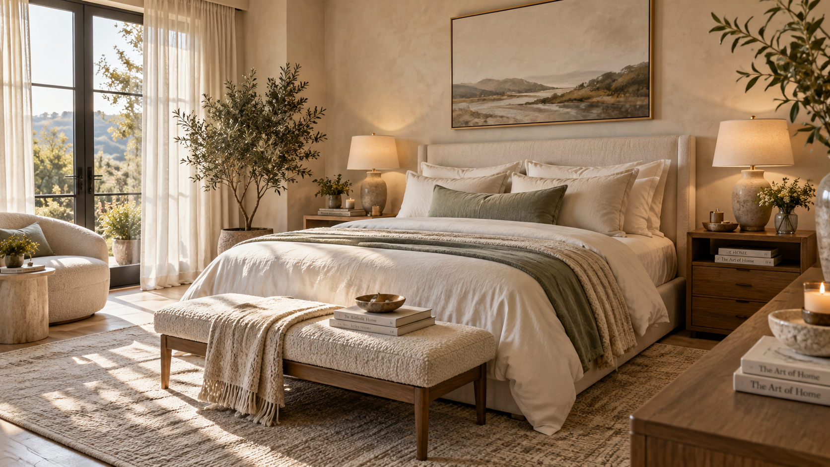
13 Bedroom Color Ideas for a Relaxing Space
Your bedroom is more than just a place to sleep; it is your ultimate personal retreat from a busy world. When you want to unwind, the visual environment you step into plays a massive role in setting the tone. Exploring various bedroom color ideas is the first step in designing a space that perfectly balances your personal aesthetic with everyday comfort. Whether your style leans toward sleek minimalism, quiet luxury, or organic modern, the right hues dictate the energy and tranquility of the room.
While design trends come and go, the goal of creating a restful sanctuary remains constant. The shades we surround ourselves with can influence our mood, helping a space feel either vibrant and energetic or grounded and serene. Instead of relying on rigid rules, modern interior design encourages a thoughtful blend of wall colors, textile tones, and furniture finishes to build a cohesive look.
In this guide, we will explore 13 versatile combinations that cover a wide range of interior styles. From deep, moody modern tones to light, coastal-inspired pastels, these palettes offer practical inspiration. We will look at how to distribute these colors across your walls, bedding, and decor, ensuring you can build a stylish, deeply comfortable retreat right in your own home.
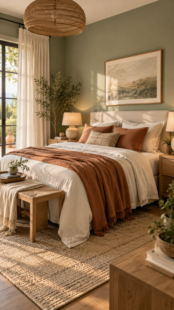
1. Soft Sage Green and Warm Terracotta
Bringing nature-inspired tones indoors is a timeless approach for an organic modern aesthetic. Soft sage acts as a gentle, muted backdrop that mimics a quiet garden, while warm terracotta introduces an earthy depth that keeps the room feeling grounded and inviting.
Why the Palette Feels Relaxing
Sage green is commonly associated with calm and balance. Because its undertones are subtle, it serves almost as a neutral, easing visual fatigue. Terracotta provides the necessary warmth to prevent the green from feeling too cool, striking a harmonious balance that feels cozy in winter and fresh during the summer months.
Where to Use Each Color
Let sage be your dominant color, applied to all four walls or as a large feature wall behind the bed. Keep your secondary color neutral—like a warm ivory for the bedding and curtains. Introduce terracotta as your accent color through linen throw pillows, a textured blanket, or unglazed ceramic table lamps.
Design Tip: If your bedroom faces north and receives cool natural light, opt for a sage green with slightly yellow undertones to keep the room from feeling chilly.
2. Dusty Blue and Warm Mustard
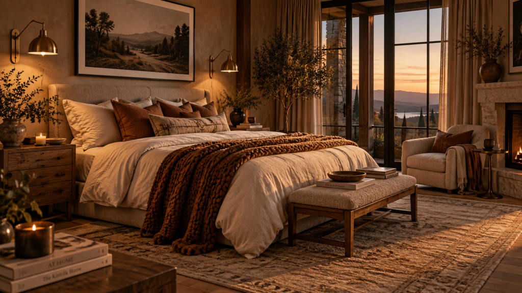
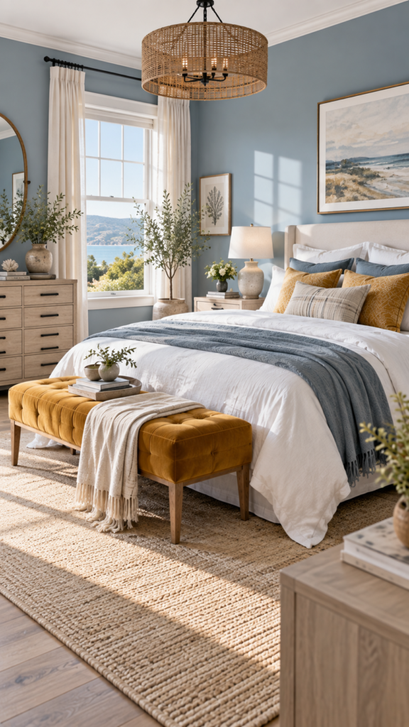
If you love a coastal or transitional aesthetic, blending dusty blue with warm mustard yellow offers a breezy yet sophisticated atmosphere. While traditional blue bedroom ideas often lean nautical, introducing a muted yellow tone brings in a comforting hint of sunshine, keeping the design dynamic.
Balancing Cool and Warm Tones
Dusty blue holds a gray undertone, which makes it incredibly soothing for a sleep space. By nature, blue recedes visually, which can make a small bedroom feel slightly larger and more open. Mustard yellow acts as an energetic but mature counterpoint, providing just enough visual contrast to give the room character without overwhelming the senses.
Best Materials for This Look
This color combination thrives on tactile contrast. Pair the smooth, cool look of painted blue walls with a rich mustard velvet bench at the foot of the bed. For furniture, whitewashed pine or weathered oak works beautifully to maintain that relaxed, airy feel.
Design Tip: Use brushed nickel or matte black hardware on your dressers to modernize this color pairing and keep it from looking too traditional.
3. Warm Beige and Creamy White
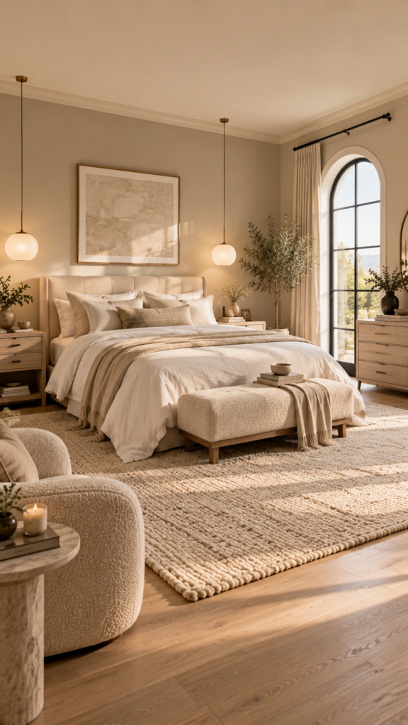
Sometimes the most effective spaces use the simplest palettes. For fans of minimal design and quiet luxury, warm beige and creamy white offer a clean, uncluttered look. Layering various shades of sand, cream, and white creates a soft, cloud-like sanctuary.
The Power of Monochromatic Layers
Without bold colors to distract the eye, a neutral palette encourages immediate physical and mental relaxation. Warm beige keeps the space from looking clinical, while creamy white adds a fresh quality. Because the tones are so similar, the success of this room relies entirely on mixing textures to build visual depth.
Lighting That Complements the Colors
Lighting is crucial in neutral bedroom schemes. Harsh, cool daylight bulbs will make beige look dreary and flat. Instead, use soft, warm bulbs (around 2700K) to highlight the cozy undertones. Symmetrical frosted glass pendants or fabric-shaded wall sconces will diffuse the light beautifully.
Design Tip: To keep a beige room from looking flat, ensure you mix at least three different fabric textures, such as crisp cotton sheets, a bouclé accent chair, and a chunky wool rug.
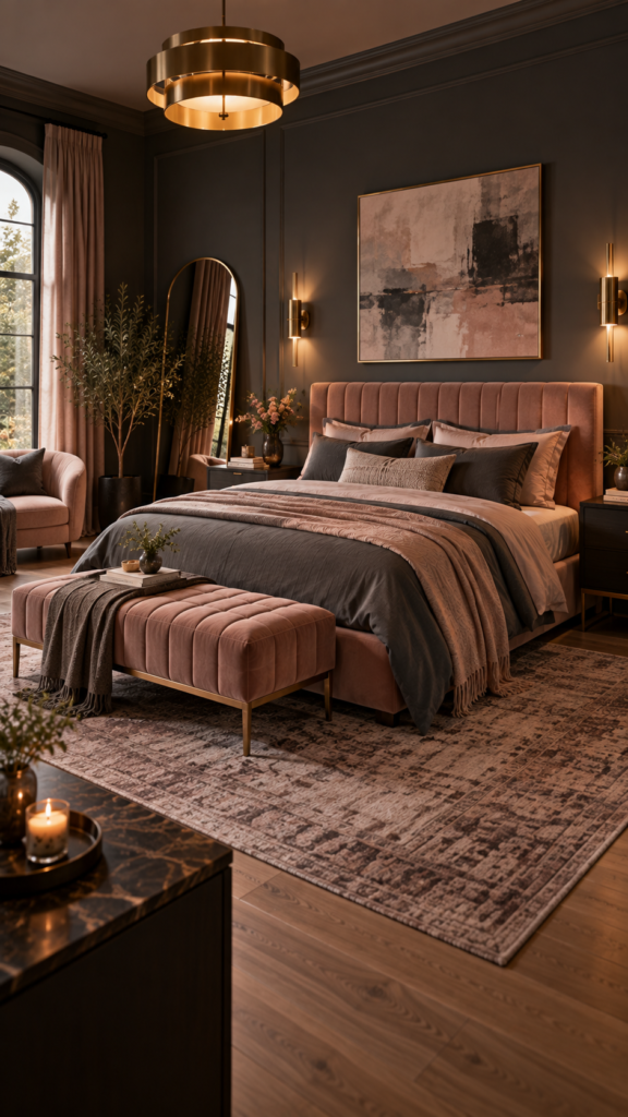
4. Moody Charcoal Gray and Blush Pink
For those who prefer a dramatic, contemporary atmosphere, moody bedroom colors offer an elegant alternative to bright white spaces. Charcoal gray balanced by soft blush pink feels intimate, secure, and highly sophisticated.
How to Keep the Room Calm
Dark walls create a cocoon-like effect that minimizes light reflection, which many find ideal for deep sleep. However, wall-to-wall charcoal can feel heavy. Introducing blush pink through soft textiles instantly breaks up the darkness, adding a romantic and gentle touch that shifts the mood from industrial to inviting.
Styling Tips
Make charcoal the dominant color on the walls, and use an upholstered blush pink bed frame or heavy pink drapery as the secondary element. To add a layer of luxury, incorporate brushed brass or gold lighting fixtures. The metallic finish will reflect light in the dim room, acting as functional jewelry for the space.
Design Tip: If your bedroom is small and lacks natural light, paint only the wall behind the headboard charcoal, keeping the other walls a soft greige to maintain a sense of space.
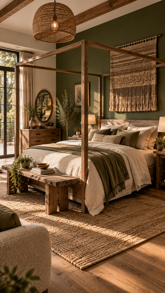
5. Deep Olive Green and Raw Wood
If you want a rustic or modern organic retreat, deep olive green combined with raw, exposed wood delivers a rich, textured experience. Among soothing bedroom colors, olive stands out for its strong visual connection to deep forests.
Bringing the Outdoors In
Olive green possesses warm, yellow undertones. In a large room, it makes the space feel cohesive and intimate; in a smaller room, it feels deliberate and cozy. This palette works exceptionally well if you have large windows facing trees, as it blurs the line between the interior and exterior.
Best Furniture Pairings
Avoid highly polished, glossy furniture. Instead, opt for a solid walnut bed, a reclaimed wood dresser, or rough-hewn floating shelves. The natural grain and imperfections in the wood highlight the organic nature of the design. Keep the bedding light—unbleached organic cotton or warm oatmeal linen—to provide visual relief from the dark walls.
Design Tip: Enhance the earthy vibe by skipping traditional framed art and hanging a large, woven textile or a piece of abstract landscape art above the bed.
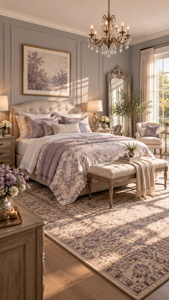
6. Gentle Lavender and Soft Gray
Lavender has long been tied to relaxation and spa environments, making it a stellar choice for a traditional or romantic bedroom design. When paired with a soft, cool gray, the result is mature, serene, and incredibly graceful.
Who This Palette Is Best For
This combination is perfect for south-facing bedrooms that get plenty of bright, warm sunlight during the day. The cool undertones of both the gray and lavender will balance the intense heat of the sun, making the room feel refreshing rather than overly warm.
Texture and Pattern Play
To prevent pale purple from looking juvenile, the gray acts as an elegant anchor. Apply a misty gray to the walls and introduce lavender softly through a patterned quilt, a faded vintage area rug, or silk pillowcases. Silver or pewter hardware on nightstands and dressers complements the cool tones beautifully.
Design Tip: Incorporate a large, ornate mirror with a silver or distressed wood frame to amplify natural light and elevate the traditional feel of the room.
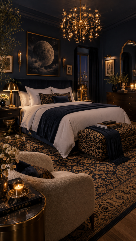
7. Deep Navy Blue and Warm Gold
For an eclectic or luxury aesthetic, deep navy blue paired with warm gold textures creates a celestial nighttime oasis. This combination stands out among various bedroom color schemes by offering a space that feels quiet and tailored, yet undeniably rich.
Creating an Elegant Atmosphere
Many people fear dark colors in small spaces, but matte navy blue actually blurs the edges of a room, creating an illusion of endless depth. The gold accents serve a vital purpose: they reflect available light and add a touch of warmth and glamour to the cool, dark backdrop.
Getting the Lighting Right
In a dark blue room, layered lighting is everything. Rely on warm-toned LED strip lighting behind the headboard, matching polished brass table lamps, and a statement chandelier. Distribute the gold evenly—perhaps through curtain rods, drawer pulls, and a metallic thread running through an accent pillow.
Design Tip: Use crisp, bright white sheets to create a sharp, classic contrast against the dark blue walls, giving the room a luxury hotel aesthetic.
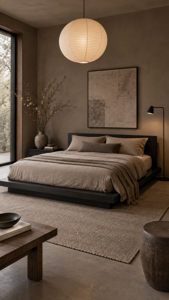
8. Earthy Taupe and Matte Black
The Japandi style—a hybrid of Japanese minimalism and Scandinavian functionality—thrives on earthy, muted palettes. Earthy taupe mixed with crisp, matte black accents offers a sophisticated, highly disciplined aesthetic that promotes immediate mental clarity.
The Japandi Approach to Color
Taupe, a beautiful blend of brown and gray, brings the warmth of earth tones without the heaviness of dark brown. It serves as a soothing, neutral canvas. The matte black is used sparingly but purposefully to create sharp, graphic lines that draw the eye and ground the soft space.
Accent Pieces That Work
Use taupe for the walls and bedding to create a seamless, unified look. Introduce matte black through the structural elements: a low-profile black platform bed, slender black picture frames, or a minimalist metal floor lamp. Keep decor minimal, focusing on quality over quantity.
Design Tip: Add a singular organic element, such as a tall branch in a ceramic vase, to break up the clean lines and soften the contrast between the taupe and black.
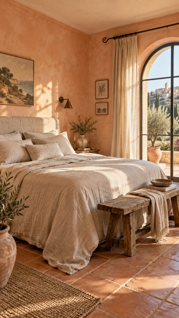
9. Muted Peach and Natural Linen
If you prefer a Mediterranean-inspired retreat, muted peach paired with natural linen tones creates a warm, sun-kissed environment. Warm bedroom colors like peach wrap the room in a gentle glow, making the space feel cheerful in the morning and highly soothing at night.
Sunlit Warmth for North-Facing Rooms
Because north-facing rooms often suffer from flat, grayish daylight, peach is an excellent remedy. It acts as an artificial sunset, injecting warmth into the shadows. Unlike bright orange or stark pink, muted peach is a soft pastel that flatters all lighting conditions.
Styling the Mediterranean Way
To capture this aesthetic, paint the walls a delicate plaster peach. Dress the bed completely in un-dyed, oatmeal-colored linen. Add subtle rustic touches like wrought iron curtain rods, terracotta floor tiles (if applicable), and a rustic wooden bench at the end of the bed.
Design Tip: Avoid stark white ceilings with peach walls, as the contrast can look jarring. Instead, paint the ceiling a soft, warm cream to keep the transition gentle.
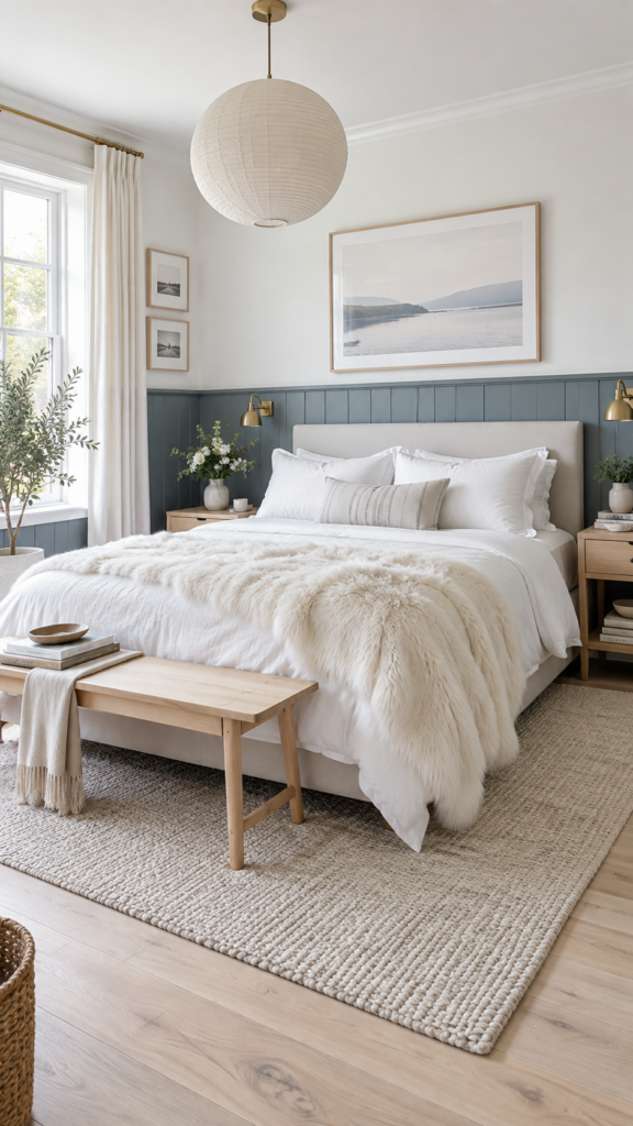
10. Cool Slate Blue and Crisp White
A staple of Scandinavian design, the combination of cool slate blue and crisp white is incredibly refreshing. It feels clean, orderly, and highly tailored, making it one of the best color combinations for promoting a restful night’s sleep.
Maximizing Light in Small Bedrooms
Slate blue has a slightly gray, almost stony undertone. When paired with bright, crisp white, it creates a high-contrast look that defines the room’s architecture. This crispness is particularly effective in small bedrooms, as the white reflects maximum light while the blue adds necessary depth.
Adding Warmth Without Clutter
To keep the cool colors from feeling frosty, introduce warmth through light ash or birch wood floors and furniture. A plush white faux fur throw or a textured wool rug will add the “hygge” (coziness) essential to Scandinavian design, without requiring colorful decor.
Design Tip: Consider painting a slate blue wainscoting or half-wall around the lower perimeter of the room, leaving the upper half crisp white to draw the eye upward and make ceilings feel taller.
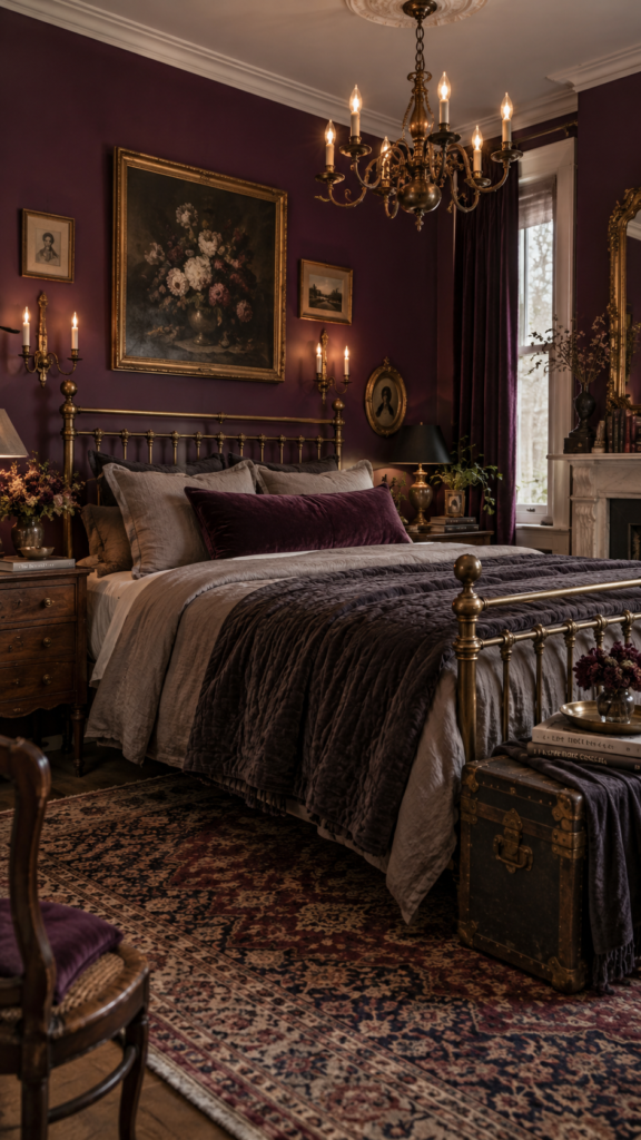
11. Rich Plum and Muted Brass
For a vintage or eclectic aesthetic, rich plum and muted brass provide a deeply luxurious experience. While dark reds can be too energetic for a bedroom, moving toward a purple-toned plum creates a regal, calming, and enveloping environment.
Moody Elegance Done Right
Plum is a heavy, saturated color that demands attention. It creates a space that feels like an upscale boutique hotel. The muted brass acts as a stunning accent, cutting through the dark walls with a warm, metallic glow that feels historically rich rather than flashy.
Balancing Dark Walls
If you paint the walls plum, keep your ceiling and trim a soft, warm white to prevent the room from feeling like a cave. Use an antique brass bed frame or a brass chandelier as the room’s focal point. Complement the walls with bedding in soft taupe or charcoal rather than bright white, which might look too stark.
Design Tip: Incorporate velvet fabrics—like a heavy velvet curtain or a lumbar pillow—as the material catches the light beautifully and enhances the richness of the plum color.
12. Warm Caramel and Ivory
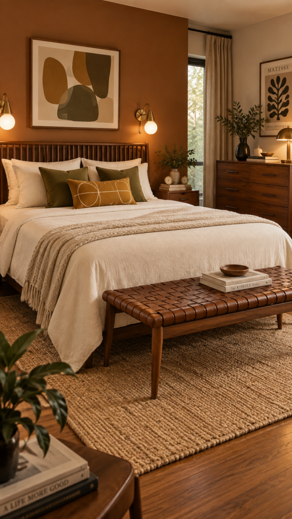
Mid-century modern lovers will appreciate the inviting combination of warm caramel and ivory. This palette feels inherently nostalgic yet completely fresh, utilizing warm, baked tones to create a highly comforting space.
Mid-Century Charm
Caramel bridges the gap between brown, yellow, and orange. It is incredibly warming but muted enough to remain relaxing. Paired with ivory, the room retains a bright, open feel while still radiating heat and coziness. It is an excellent alternative to standard beige.
Integrating Wood Tones
Mid-century design relies heavily on wood, particularly walnut or teak. The caramel walls will naturally pull out the rich tones in a walnut dresser or a slatted wooden headboard. Keep the bedding a solid, creamy ivory, and add a few geometric patterned throw pillows in deep mustard or olive to complete the look.
Design Tip: Use caramel as a large block of color behind the bed, or incorporate it heavily through leather elements, like a woven leather bench at the foot of the bed.
13. Soft Greige and Forest Green
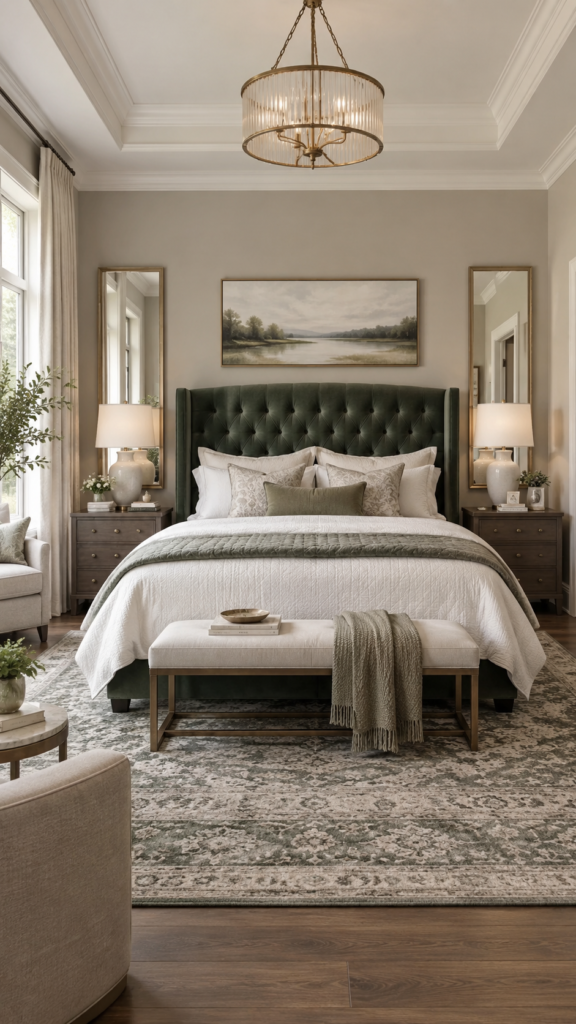
For a beautifully transitional bedroom that blends traditional elegance with modern lines, soft greige (gray-beige) paired with deep forest green is a winning combination. It offers the safety of a neutral room with a striking, sophisticated pop of color.
Grounding the Space
Greige is the ultimate chameleon color; it responds beautifully to both natural and artificial light. By using greige on the walls, the room remains bright and airy. Forest green, used as a secondary or accent color, anchors the design, giving the eye a solid place to rest.
Creating Visual Interest
Paint the walls a soothing matte greige. Introduce the forest green through a large, tufted velvet headboard, or a set of heavy floor-to-ceiling drapery. Add a pair of symmetrical ceramic table lamps with crisp white shades to elevate the transitional aesthetic.
Design Tip: Tie the room together by placing a large, patterned area rug under the bed that features subtle hints of both greige and green.
How to Choose the Right Bedroom Color Palette
With so many beautiful bedroom paint colors available, narrowing down your final choice can feel overwhelming. To ensure your selected palette works practically in your space, consider these essential factors before buying paint:
- Analyze Natural Light: A north-facing room with cool light benefits from warm tones (beiges, caramels, peaches). A south-facing room with bright, warm light can beautifully handle cool colors (blues, grays, lavenders).
- Consider Room Size: Dark colors can make a small room feel cozy and expansive by blurring the corners, while light colors can make a small space feel crisp and airy. Choose based on whether you want a “cocoon” or a “cloud” feeling.
- Match Existing Furniture: Look at your current bed frame and dressers. Wood with red undertones (like cherry) pairs well with greens and blues, while ash or oak pairs perfectly with soft neutrals and pastels.
- Define the Mood: Ask yourself how you want to feel at 10 PM. If you need to shut down a busy mind, stick to muted blues and greens. If you want to feel comforted and warm, look toward taupes, beiges, and terracottas.
What Are the Most Relaxing Colors for a Bedroom?
While personal preference always takes priority, interior designers widely agree that certain hues naturally promote a restful environment. Muted blues are commonly associated with calm and tranquility, making them a top choice for sleep spaces. Soft, earthy greens help create a grounded, nature-inspired atmosphere that eases visual tension.
Additionally, warm neutrals like taupe, greige, and soft beige are highly relaxing because they reduce visual clutter. By keeping the color palette quiet, your brain has less information to process, helping you wind down faster at the end of the day. The key is to choose muted or dusty versions of your favorite colors, avoiding highly saturated or neon tones.
Frequently Asked Questions
What is the most relaxing color for a bedroom?
Soft, muted blues and sage greens are widely considered the most relaxing options. They echo the colors of the sky and nature, helping to create a serene, tranquil atmosphere.
What colors make a bedroom feel cozy?
Warm tones are best for coziness. Think of earthy terracotta, warm beige, caramel, or dark, enveloping shades like charcoal gray and rich plum.
Should a bedroom be light or dark?
This depends entirely on your preference. Light bedrooms feel refreshing and are great for waking up energized, while dark bedrooms create a “cocoon” effect that is excellent for promoting deep, uninterrupted sleep.
What bedroom colors work well in small rooms?
Crisp whites, soft greiges, and slate blues reflect light and make small spaces feel larger. Alternatively, going completely dark (like navy) can blur the room’s edges, making the small size feel intentional and luxurious.
How many colors should you use in a bedroom?
A good rule of thumb is to stick to three main colors. Use a dominant color for the walls (about 60% of the room), a secondary color for large textiles like bedding (30%), and an accent color for pillows, art, and decor (10%).
Conclusion
Ultimately, the best bedroom color ideas are not about following passing trends, but about designing a space that supports your daily rest. Whether you are drawn to the crispness of Scandinavian slate blue, the earthy warmth of an organic sage green, or the moody luxury of charcoal gray, the magic lies in how you balance those colors with lighting, textiles, and furniture.
Take your time exploring these palettes. Consider testing a few paint swatches on your walls to see how they react to your room’s natural light throughout the day. By thoughtfully applying your favorite combination from this list, you can transform your bedroom into a highly stylish, deeply restful sanctuary.