How to Choose the Right Color Palette for Your Home
Designing a new space or refreshing an old one is an exciting journey, but standing in front of a wall of paint swatches can quickly feel overwhelming. You are not just picking a single color; you are trying to figure out how to choose a color palette for your home that works with your existing furniture, room size, and lighting.
The truth is, many homeowners struggle with this process. A color that looks beautiful in a brightly lit hardware store might look dull in a dark hallway, or it might accidentally clash with the hidden undertones of your wood floors. Choosing colors does not have to be a guessing game.
By understanding a few foundational design principles, you can confidently create interior color schemes that make your house feel cohesive, intentional, and welcoming. In this guide, we will walk you through the practical steps of building a beautiful color palette, from analyzing natural light to avoiding common decorating mistakes.
Understanding Color Theory for Interior Design
Before buying your first can of paint, it helps to understand a few basic principles of color theory for interior design. You do not need an art degree to get this right; you just need to know how colors relate to one another on the color wheel.
Most successful home interior color combinations rely on one of these three basic approaches:
- Monochromatic: This scheme uses various shades, tints, and tones of a single base color. For example, a monochromatic room might feature deep navy blue walls, medium blue curtains, and soft pastel blue throw pillows. It creates a highly calming, unified look.
- Analogous: Analogous colors sit next to each other on the color wheel, such as blue and green, or yellow and orange. Because they share similar base tones, they blend smoothly and create a harmonious, serene living space.
- Complementary: These colors sit directly opposite each other on the color wheel, such as blue and orange. This approach creates high contrast and vibrant energy. In a home, it is best to use one as the dominant wall color and the other as a subtle accent.
How to Choose Colors for Your Home
Knowing how to choose colors for your home rarely starts with the paint itself. Unless you are starting with a completely empty house and a limitless budget, you will need to build your palette around the architectural elements and belongings you already have.
Start With an Inspiration Piece
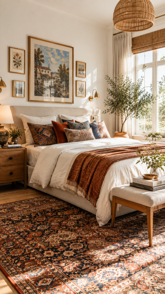
The easiest way to build a color palette for home decor is to pull colors from an existing item you love. Look at a favorite Persian rug, a large piece of artwork, or a patterned accent chair. Choose one dominant neutral color from this piece for your walls, and pick one or two smaller, bolder colors from the pattern to use for pillows, curtains, and accessories.
Consider Natural Lighting
Light fundamentally changes how the human eye perceives color. A paint color that looks warm in one room can look cold and shadowy in another. Always consider the direction your windows face:
- North-facing rooms: These spaces receive cool, indirect, bluish light. To balance the chill, lean toward warmer colors like soft yellows, earthy terracottas, or warm creamy whites.
- South-facing rooms: These rooms get intense, warm sunlight throughout the day. You can comfortably use cool colors like soft blues, sage greens, and cool grays here without the space feeling icy.
- East-facing rooms: Expect bright morning light that turns shadowy in the afternoon. Warm palettes work well here to compensate for the lack of afternoon sun.
- West-facing rooms: These rooms can feel dull in the morning but glow with intense warm light in the late afternoon.
Additionally, pay attention to your artificial lighting. LED bulbs come in various temperatures. Warm white bulbs (around 2700K) will make your paint look yellower, while daylight bulbs (5000K) will make colors look crisper and cooler.
Quick Reference: Matching Paint to Room Direction
| Room Direction | Light Characteristics | Best Paint Choices |
|---|---|---|
| North-Facing | Cool, indirect, bluish light | Warm whites, soft yellows, earthy terracottas |
| South-Facing | Bright, intense, warm sunlight | Cool grays, soft blues, sage greens, crisp whites |
| East-Facing | Bright mornings, shadowy afternoons | Warm neutrals, soft peaches, subtle greens |
| West-Facing | Dull mornings, warm afternoon glow | Cooler tones or warm neutrals to balance the heat |
Think About Room Size and Purpose
Generally, light colors reflect more light, making a small room feel larger and more open. Dark colors absorb light, drawing the walls in to make a space feel cozy and intimate. Consider how you want the room to feel before choosing your depth of color.
Consider Your Existing Furniture and Finishes
Your flooring, kitchen cabinets, and large pieces of furniture (like a sectional sofa) are usually the most expensive items in a room. Your wall paint must coordinate with them, not fight them. If you have warm cherry wood floors, a cool, icy gray wall paint will likely clash.
Pay Attention to Undertones
Understanding undertones is the secret to selecting the best colors for home decor. Even “neutral” colors like white, beige, gray, and taupe have hidden hints of other colors. A beige paint might have a yellow, pink, or green undertone.
If you pair a beige wall that has a pink undertone with a beige sofa that has a yellow undertone, the room will feel slightly “off,” even though both items are technically beige. To test undertones, hold your paint swatch against a sheet of pure white printer paper in natural light. The contrast will immediately reveal whether the neutral leans green, blue, pink, or yellow.
4 Home Color Palette Ideas to Try
If you need some inspiration, here are four versatile home color palette ideas that can adapt to various design styles, from modern and traditional to contemporary and transitional.
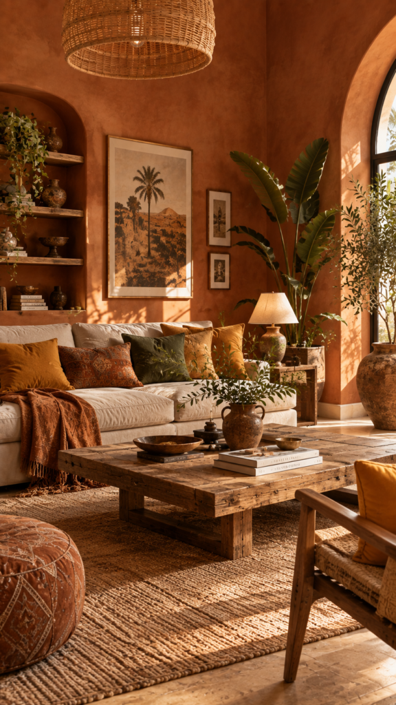
Warm Earthy Color Palette
This palette relies on warm, sun-baked colors inspired by nature. Think of rich terracotta, muted mustard yellow, olive green, and warm sand. It works wonderfully for creating a grounded, welcoming, and slightly rustic atmosphere. Pair these colors with natural wood furniture, leather accents, and brass hardware.
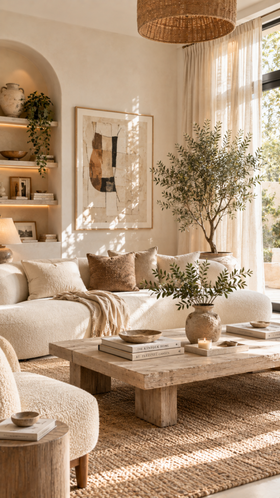
Neutral Color Palette
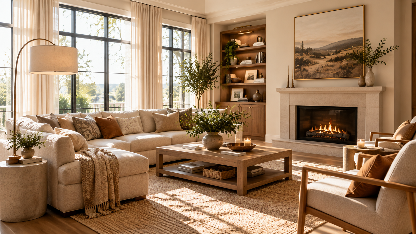
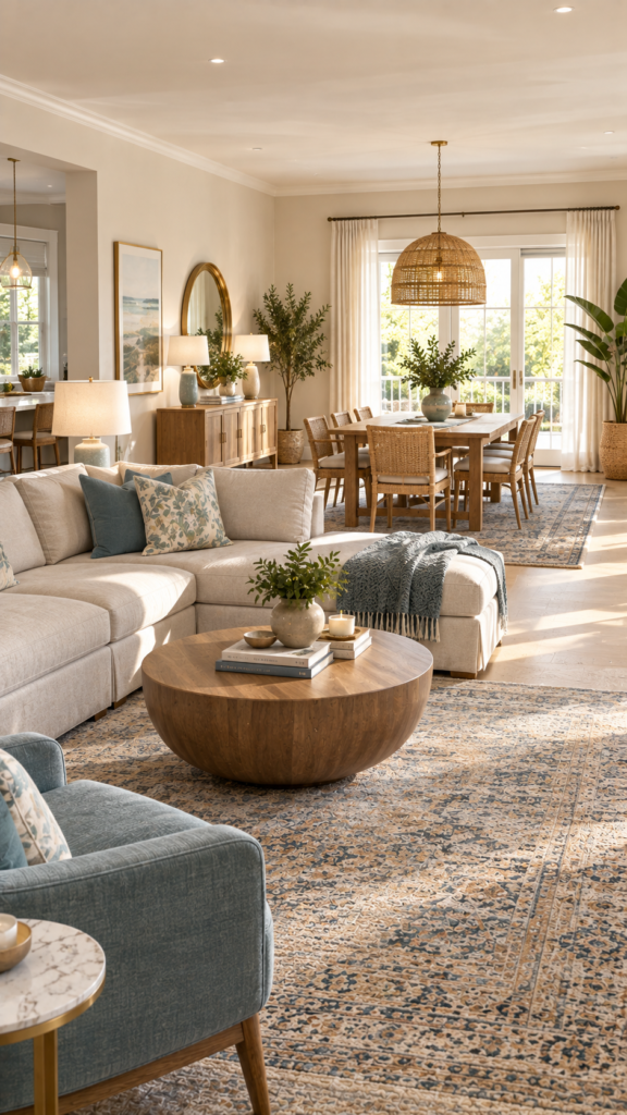
A neutral color palette for home decor is timeless and serene. The scheme revolves around stark white, warm beige, soft ivory, and light taupe. The secret to keeping a neutral room from looking boring is layering textures. Mix chunky knit blankets, smooth linen curtains, and rough jute rugs to add visual interest without adding loud colors.
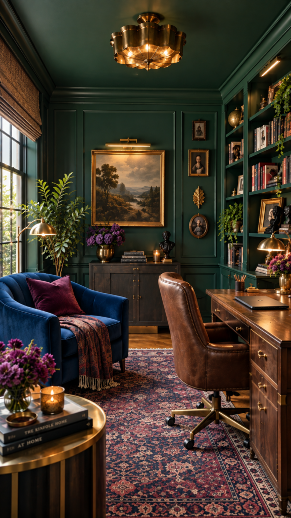
Moody Jewel-Tone Color Palette
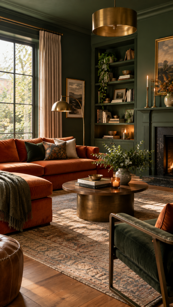
For those who love rich, dramatic spaces, jewel tones are an excellent choice. This palette features deep emerald green, sapphire blue, and rich plum. It is perfect for dining rooms, home offices, or cozy dens. You can use a technique called “color drenching” by painting the walls, trim, and ceiling in the same dark hue for a sophisticated, immersive feel.
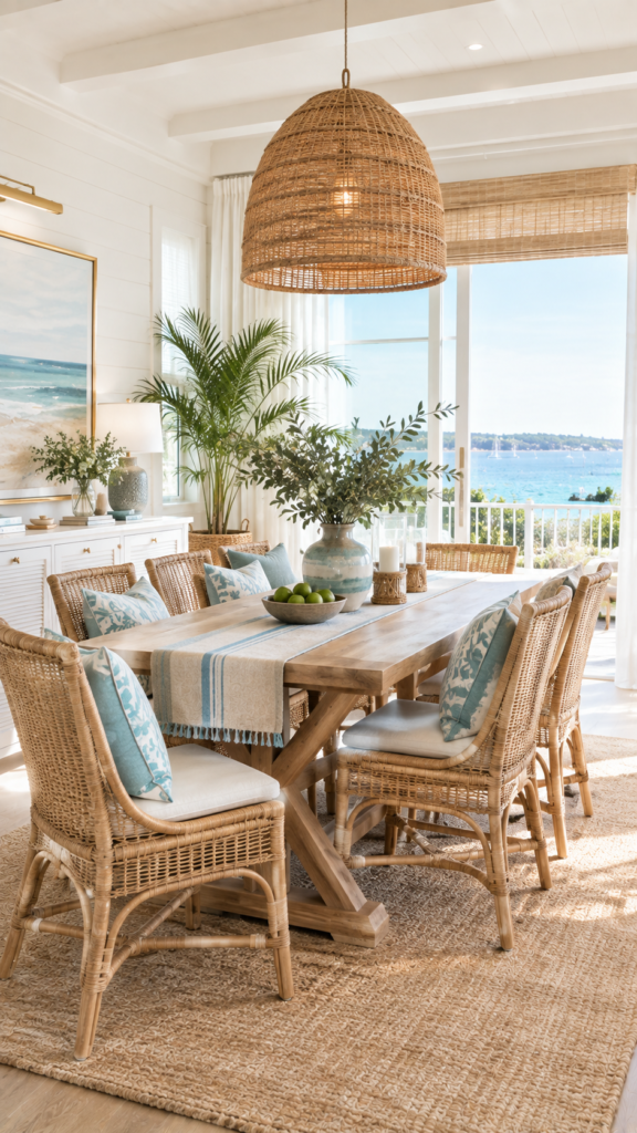
Coastal Color Palette
A coastal palette blends crisp whites with soft seafoam greens, ocean blues, and sandy tans. It provides a relaxed, breezy, and uplifting environment. This scheme is highly versatile and works beautifully in bathrooms, bedrooms, and sunny living rooms.
How to Coordinate Colors in a Room
Once you select your colors, deciding where to put them is the next challenge. A simple color palette formula to follow involves identifying four key roles:
Base/Neutral Color + Dominant Color + Secondary Color + Accent Color
Your base color is usually the wall paint. Your dominant color might be your large furniture pieces. The secondary color appears in rugs or curtains, while the accent color is saved for small decor items. Structuring your palette this way prevents any single hue from overwhelming the room.
Understanding the 60-30-10 Rule
To distribute your colors effectively, many designers rely on the 60-30-10 rule. Keep in mind that this is a helpful guideline, not a strict law. You can adjust the percentages based on your personal style.
- 60% Dominant Color: This sets the backdrop. It usually includes the walls, large area rugs, or the ceiling.
- 30% Secondary Color: This color supports the main color while providing contrast. It is often used on upholstery, curtains, or an accent wall.
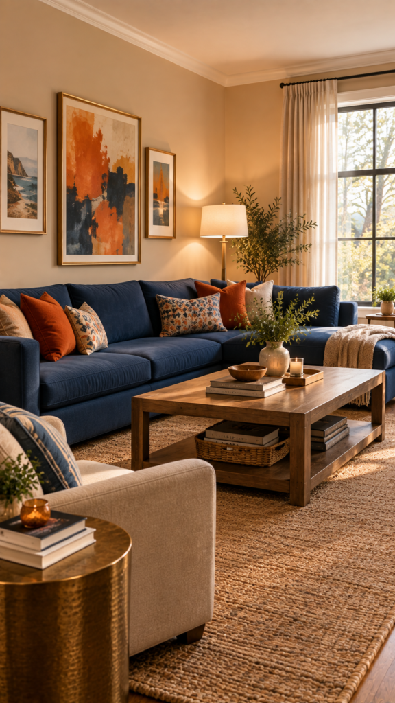
- 10% Accent Color: This is your pop of character. Use it in small doses through throw pillows, artwork, lampshades, or vases.
For example, in a living room, 60% might be warm beige walls, 30% might be a navy blue sofa and curtains, and 10% might be burnt orange throw pillows.
How to Mix Colors in Interior Design
Learning how to mix colors in interior design confidently comes down to creating visual bridges. A visual bridge is a multi-colored element that connects two solid colors together.
If you have a solid green sofa and a solid pink accent chair, they might feel disconnected. However, if you place a throw pillow on the sofa that features a floral pattern of both green and pink, you instantly connect the two pieces.
Another excellent tip is to repeat your accent colors at least three times. If you introduce a mustard yellow vase, add a yellow picture frame on the wall, and a yellow tone in your rug. Triangulating the color helps the room feel cohesive rather than random.
Living Room Color Palette Ideas
Because the living room is highly visible, your living room color palette ideas often dictate the flow for the rest of the house, especially in open-concept layouts.
If your living room, dining room, and kitchen share the same visual space, avoid painting each zone a drastically different color. Instead, choose one overarching neutral paint color for all the connected walls. Then, use different 30% and 10% colors in your rugs and furniture to gently define the separate living zones.
How to Choose Colors for Different Rooms
Different rooms serve different purposes, and your color choices should reflect how you want to feel in each space.
Bedroom
Bedrooms should prioritize rest and relaxation. Soft blues, muted greens, and gentle lavenders are frequently used to create a calm and relaxing atmosphere. If you prefer warmer palettes, stick to soft blushes, warm taupes, or earthy clays rather than highly stimulating, bright reds.
Kitchen
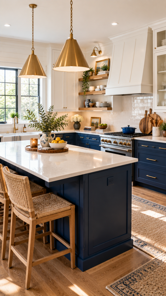
Kitchens are active, high-energy workspaces. Clean whites are always popular because they feel sanitary and bright. However, if you want more character, consider colored cabinetry. Sage green or deep navy lower cabinets paired with white uppers can add beautiful depth without making the kitchen feel dark.
Bathroom
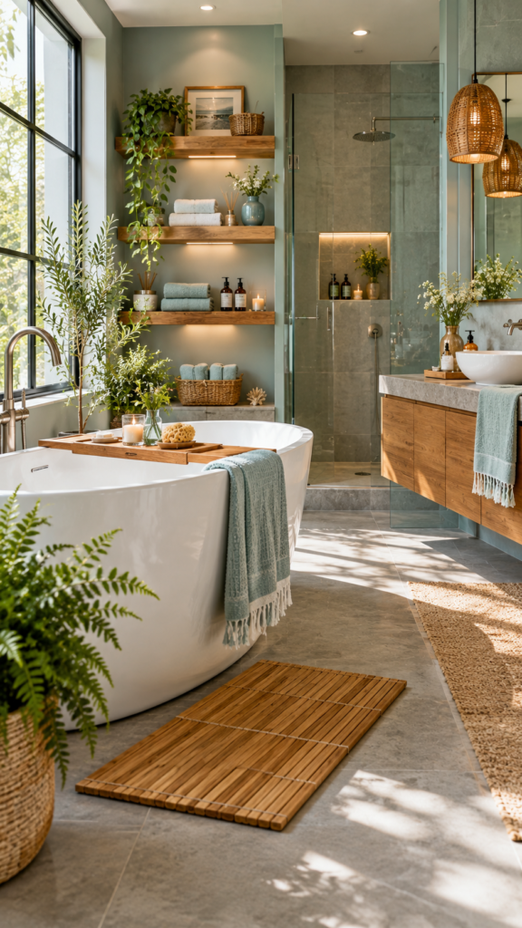
Because bathrooms are often small and lack extensive natural light, spa-like colors work exceptionally well. Crisp whites, warm grays, and soft aquas make the space feel fresh and larger. You can easily warm up a cool bathroom palette by incorporating natural wood finishes, like floating shelves or a bamboo bath mat.
Common Color Palette Mistakes to Avoid
Even with a solid plan, it is easy to make a few missteps along the way. Keep these practical tips in mind:
- Choosing paint before furniture: There are thousands of paint colors, but your choices for a sofa or flooring are limited. Always select your large furniture and fabrics first, then match the paint to them.
- Ignoring undertones: Failing to test a neutral color against your flooring or counters can lead to clashing warm and cool tones.
- Testing only a tiny paint swatch: Never rely on a 2-inch paper square. Paint a large poster board and move it around the room to see how the color looks on different walls.
- Choosing colors under store lighting: Hardware store fluorescent lights distort color. Always evaluate paint samples in your own home’s natural and artificial lighting.
- Forgetting room-to-room flow: Moving from a bright yellow room directly into a dark purple hallway can feel jarring. Keep a thread of consistency, such as using the same trim color throughout the house.
- Following trends blindly: Just because a color is named “Color of the Year” doesn’t mean it suits your home’s lighting or your personal taste.
Frequently Asked Questions
What is the 60-30-10 rule in interior design?
It is a classic decorating guideline that helps balance colors. You use a dominant color for 60% of the room (like walls), a secondary color for 30% (like furniture), and an accent color for 10% (like pillows and art).
How many colors should you use in one room?
Most designers recommend sticking to three to five colors per room to maintain a cohesive look. This usually includes one or two neutrals as a base, one dominant color, and one or two accent colors.
Should every room in a house have the same color palette?
No, every room does not need the exact same palette, but the home should flow. You can achieve this by carrying at least one coordinating color from room to room, or by keeping the trim and ceiling colors consistent throughout the house.
How does natural light affect paint colors?
Natural light changes throughout the day and varies by direction. North-facing light makes colors look cooler and more blue, while south-facing light makes colors look warmer and more yellow. Always test your paint samples in the morning, afternoon, and evening.
How do I choose a color palette that works with my furniture?
Identify the dominant color or undertone in your largest pieces of furniture (like a sofa, flooring, or a large rug). Use the color wheel to select a wall paint that either complements those tones (for contrast) or sits analogous to them (for a seamless blend).
What are some good neutral colors for a home?
Warm whites, creamy beiges, soft taupes, and light grays (greige) are excellent neutral choices. They provide a versatile backdrop that allows you to easily swap out colorful accessories as your taste changes.
Conclusion
Figuring out how to choose a color palette for your home doesn’t require strict adherence to rigid design rules. Instead, it is about understanding how light, undertones, and your existing belongings interact with one another.
By starting with an inspiration piece, testing your paint samples at different times of the day, and applying practical guidelines like the 60-30-10 rule, you can design rooms that feel intentional and harmonious. Trust your eye, take your time experimenting with different paint color ideas, and most importantly, choose colors that make you happy to come home.