15 Timeless Living Room Color Ideas for Dreamy Decor
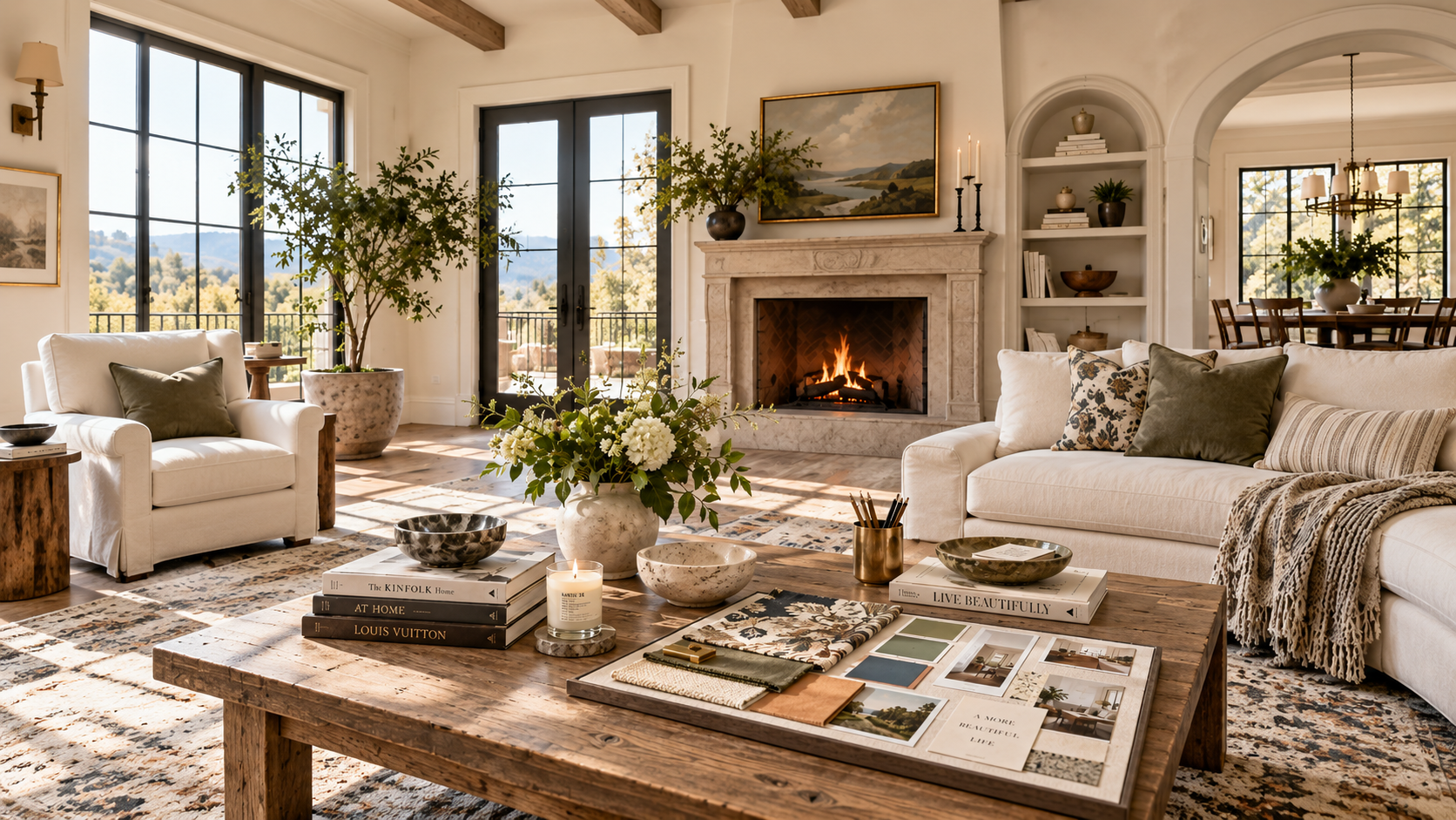
Finding the perfect color palette sets the entire mood of your home. If you want a space that feels cohesive, stylish, and inviting, choosing the right living room color combinations is your most important first step. Whether you gravitate toward soft relaxing neutrals, crisp contemporary contrasts, or rich dramatic hues, the colors you place on your walls, furniture, and decor tell a unique story.
Many homeowners struggle with finding the best colors for living rooms because it is easy to feel overwhelmed by endless paint swatches and fabric samples. This guide will walk you through 15 distinct, beautiful, and highly achievable living room color ideas. From timeless traditional spaces to modern minimalist retreats, these palettes cover a wide variety of moods and interior styles.
You will discover exactly which shade should dominate the room, which should act as a supporting secondary color, and how to place your accents strategically. Let’s explore these interior color schemes to help you build a beautifully balanced room.
| Color Combination | Overall Feel | Best For |
|---|---|---|
| Warm White + Natural Wood + Sage Green | Fresh, warm, and natural | Relaxed everyday living rooms |
| Beige + Terracotta + Cream | Warm and earthy | Cozy, sun-filled spaces |
| Navy Blue + Warm White + Camel | Classic and sophisticated | Timeless interiors |
| Forest Green + Burnt Orange + Cream | Rich and dramatic | Eclectic living rooms |
| Soft Gray + Blush Pink + Charcoal | Soft and contemporary | Modern apartments |
| Cream + Chocolate Brown + Olive Green | Warm and nostalgic | Vintage-inspired rooms |
| Dusty Blue + Beige + Warm Wood | Calm and welcoming | Country-inspired interiors |
| Greige + Black + Cognac | Modern and sophisticated | Urban and industrial spaces |
| Sage Green + Warm White + Terracotta | Fresh and organic | Nature-inspired rooms |
| Navy + Mustard Yellow + Cream | Bold and cheerful | Mid-century inspired spaces |
| Taupe + Rust + Ivory | Warm and understated | Minimalist interiors |
| Olive Green + Beige + Brass | Elegant and grounded | Traditional living rooms |
| Soft Blue + Terracotta + Natural Wood | Relaxed and sun-washed | Mediterranean-inspired spaces |
| Charcoal + Cream + Camel | Cozy and sophisticated | Modern rustic rooms |
| Warm White + Burgundy + Walnut | Rich and timeless | Vintage and eclectic interiors |
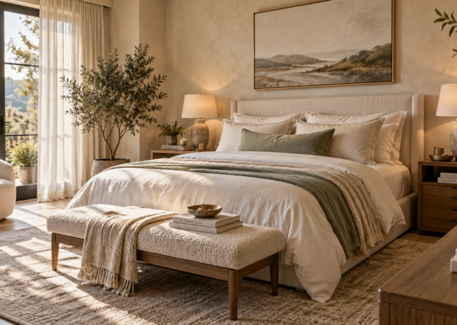
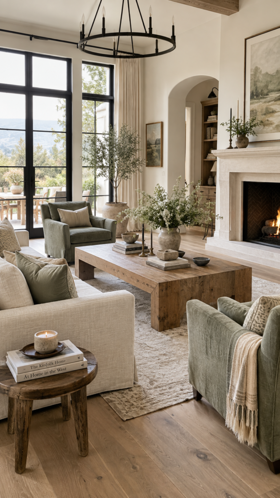
1. Warm White + Natural Wood + Sage Green
This palette creates a calm, natural, and sophisticated living room with an airy feel. It relies on analogous color harmony—colors that sit near each other in nature—to create a soothing environment. The gentle contrast between the crisp background and the earthy green makes this one of the most reliable neutral living room color combinations available.
Dominant Color: Warm white should cover your walls to create a bright, expansive canvas that reflects natural light beautifully.
Secondary Color: Natural wood tones serve as the grounding force. Bring this in through wide-plank oak flooring, a solid wood coffee table, or exposed architectural beams.
Accent Color: Sage green breathes life into the room without overpowering the peaceful mood.
To style this room, place a large warm white linen sectional over a textured rug. Introduce sage green through soft throw pillows, subtle watercolor artwork, and upholstered accent chairs. Keep your metals matte black or brushed brass for a clean, tailored finish.
Styling Tip: Stick to light and medium woods like white oak and ash. Dark, heavy woods can disrupt the breezy, organic atmosphere of this specific palette.
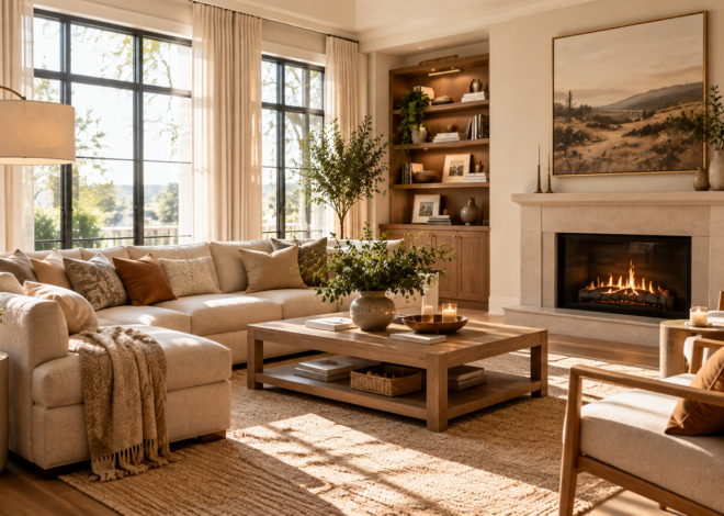
2. Beige + Terracotta + Cream
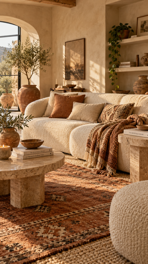
If you want a space that feels warm, earthy, and welcoming, this sun-baked color palette is a perfect choice. It focuses heavily on tactile materials and warm undertones, wrapping the room in a cozy embrace. Warm living room color schemes like this one excel in rooms that receive plenty of afternoon sunlight.
Dominant Color: Beige acts as your foundation. Consider using a textured limewash paint on the walls to give the room an earthy, masonry-like quality.
Secondary Color: Cream brightens the space and provides soft visual relief. Use cream for your window treatments, a chunky rug, and a cozy boucle sofa.
Accent Color: Terracotta adds a punch of heat and energy, drawing the eye and grounding the design.
Bring terracotta into the space through large clay planters, patterned wool rugs, and heavy woven throw blankets. You can also incorporate terracotta-colored linen cushions to balance the lighter cream fabrics.
Styling Tip: Incorporate natural stone elements, such as a travertine side table, to enhance the earthy, grounded aesthetic of these warm colors.
3. Navy Blue + Warm White + Camel
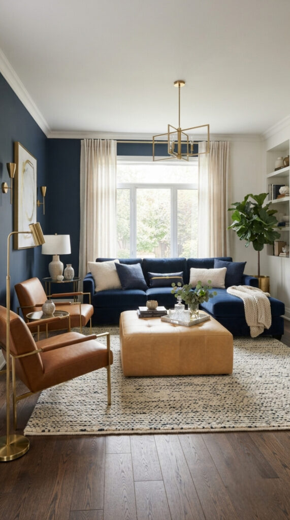
This combination is crisp, tailored, and highly sophisticated. It utilizes complementary color theory by pairing the cool depth of navy blue with the warm, orange-leaning tones of camel. The sharp contrast creates a striking visual identity that works beautifully in transitional or classic modern homes.
Dominant Color: Navy blue creates a moody, anchoring effect. Use it on a large accent wall behind the sofa, or commit to a massive navy blue velvet sectional as the room’s focal point.
Secondary Color: Warm white balances the darkness of the navy. Paint the remaining walls warm white and use sheer curtains to keep the room feeling open.
Accent Color: Camel brings necessary earthy warmth that prevents the blue and white from feeling too cold or nautical.
Introduce camel exclusively through rich textiles and leathers. A buttery camel leather ottoman or a pair of sleek leather lounge chairs will bridge the gap between the dark navy and bright white.
Styling Tip: Use polished nickel or brass lighting fixtures. The metallic sheen highlights the sleekness of the navy while complementing the warmth of the camel.
4. Forest Green + Burnt Orange + Cream
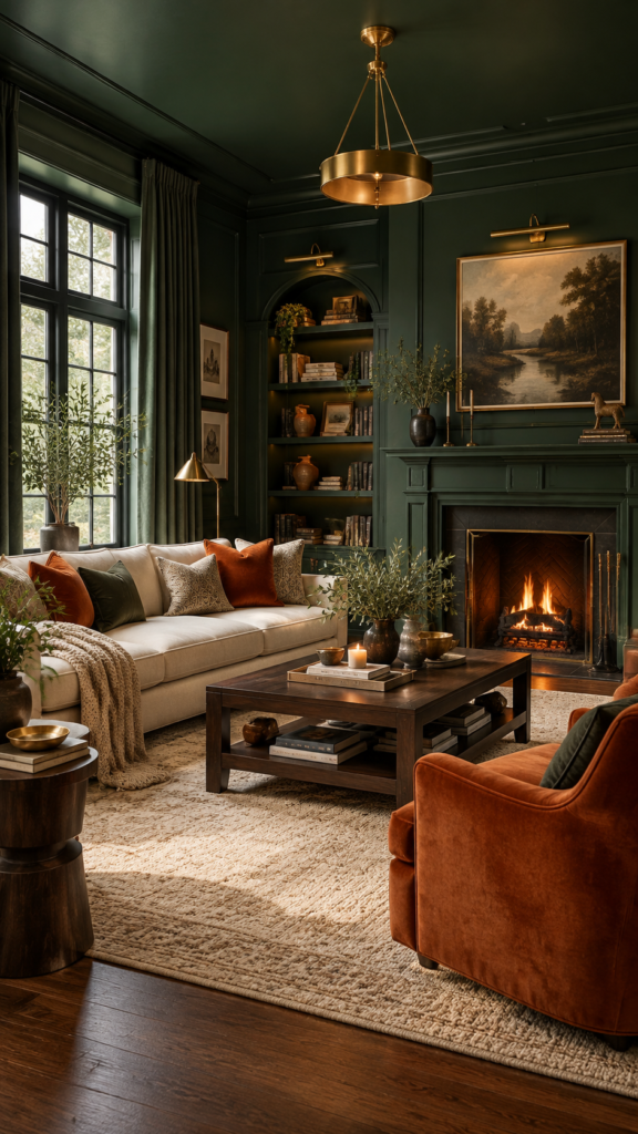
For those who prefer a rich, dramatic living room with plenty of depth and personality, this jewel-toned palette is highly effective. The strong warm-cool contrast between the green and orange makes this one of the most engaging living room paint color combinations for creating an intimate, den-like atmosphere.
Dominant Color: Forest green sets a lush, enveloping tone. Try color drenching—painting the walls, ceiling, and trim this deep green—to create a highly immersive space.
Secondary Color: Cream cuts through the dark background to provide visual breathing room. A light cream sofa and a soft cream area rug stand out brilliantly against dark walls.
Accent Color: Burnt orange acts as a vibrant complementary color, adding a spark of energy to the muted green.
Use burnt orange in your artwork, velvet accent pillows, or a bold accent chair. The saturation of the orange holds its own against the heavy green.
Styling Tip: Incorporate dark mahogany or walnut woods. The dark wood grains seamlessly blend into the moody environment while elevating the room’s sophistication.
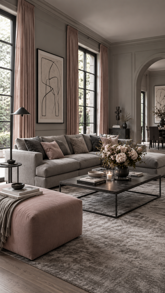
5. Soft Gray + Blush Pink + Charcoal
This palette proves that a living room color palette can be soft and elegant without feeling overly sweet. By using cooler gray tones mixed with a delicate, warm pink, you achieve a space that feels gently contrasting and uniquely modern.
Dominant Color: Soft gray offers a serene, cooling backdrop. Use it on the walls and in large furniture pieces, like a sprawling tailored sofa.
Secondary Color: Blush pink softens the coolness of the gray. It adds a gentle touch of warmth and color.
Accent Color: Charcoal provides necessary definition and edge, stopping the light colors from looking washed out.
Incorporate blush pink through heavy cotton drapery, an upholstered ottoman, or a cluster of varied throw pillows. Use charcoal for high-contrast details like matte metal window frames, a sleek iron coffee table, or abstract line art.
Styling Tip: Keep the blush pink muted and dusty rather than bright or saturated. This ensures the color combination remains mature and refined.
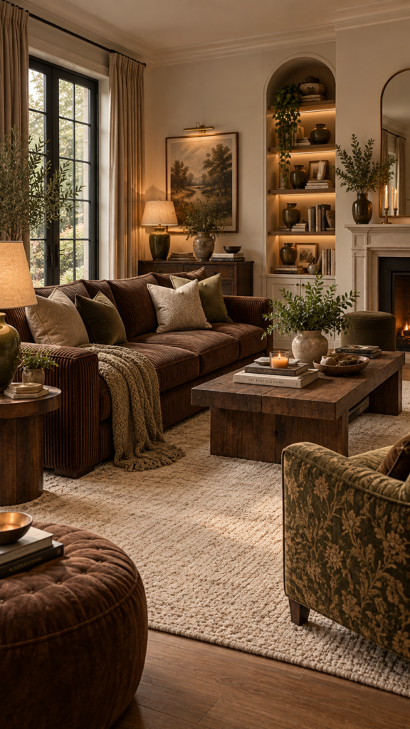
6. Cream + Chocolate Brown + Olive Green
Cozy, grounded, and deeply comforting, this palette relies on earthy depth and tonal layering. If you want a room that feels like a quiet, protected retreat, this nostalgic combination works wonders.
Dominant Color: Cream acts as the neutral base, keeping the heavier brown and green from making the room feel enclosed.
Secondary Color: Chocolate brown anchors the space with rich warmth. A chunky corduroy or suede chocolate brown sofa is the perfect centerpiece here.
Accent Color: Olive green connects the palette to nature and adds a subtle, muted splash of color.
Blend these colors by placing your dark brown seating on a large cream area rug. Use olive green for ceramic table lamps, heavy knit throws, and patterned upholstered armchairs.
Styling Tip: Introduce warm ambient lighting through fabric lampshades and wall sconces. The soft light will highlight the rich undertones of the brown and green fabrics.
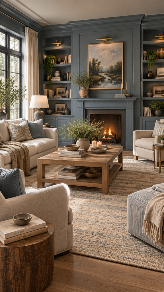
7. Dusty Blue + Beige + Warm Wood
Timeless, inviting, and peaceful, this palette is an excellent choice for homeowners who want a colorful space that still feels tranquil. It relies on low-contrast transitions between soft, muted tones.
Dominant Color: Dusty blue brings a peaceful, sky-like quality to the room. Use it on wall wainscoting, built-in bookshelves, or as the primary wall color.
Secondary Color: Beige warms up the cool blue tones. Bring it in through linen armchairs, a large flat-weave rug, and textured wall hangings.
Accent Color: Warm wood tones act as the visual anchor, giving the soft colors a solid, grounded foundation.
Choose an oak or mango wood coffee table and matching floating shelves. Keep the fabrics organic and relaxed, using plenty of washed linen and raw cotton.
Styling Tip: Avoid stark, bright whites in this palette. Stick to warm beige and cream to maintain a soft, harmonious transition between the cool blue and warm wood.
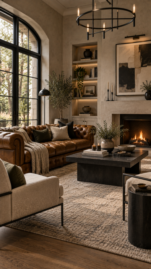
8. Greige + Black + Cognac
This combination creates a modern, refined, and striking environment. It merges a versatile neutral base with high-contrast punctuation. This is one of the most effective modern living room colors for contemporary homes or spaces with strong architectural lines.
Dominant Color: Greige (a blend of gray and beige) provides a warm yet modern background. Consider a subtle plaster finish for the walls to add visual texture.
Secondary Color: Cognac offers a burst of warmth and luxury. A classic tufted cognac leather sofa instantly elevates the entire room.
Accent Color: Black adds sharp contrast and punctuation, giving the eye a distinct place to rest.
Distribute black evenly throughout the space to keep it balanced. Use it on curtain rods, metal lighting fixtures, thin picture frames, and the legs of your accent chairs. The greige walls will perfectly soften the starkness of the black details.
Styling Tip: Keep decorative clutter to a minimum. Let the sharp contrast between the black hardware and the rich cognac leather serve as the primary visual interest.
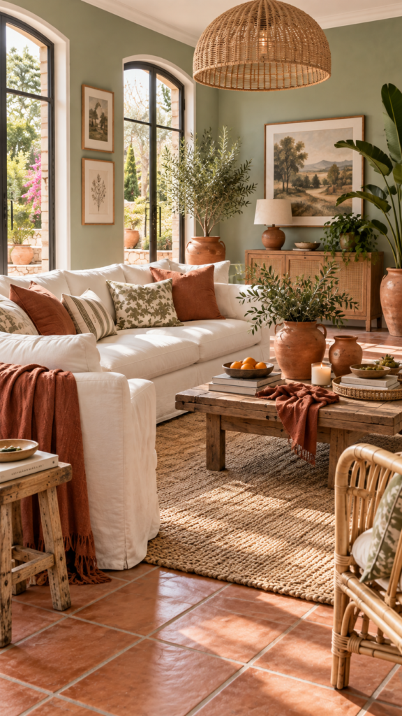
9. Sage Green + Warm White + Terracotta
Fresh, airy, and energetic, this palette utilizes a complementary color dynamic (green paired with red-leaning terracotta) to create a lively yet balanced space. When people search for color combinations for living room spaces that feel both vibrant and relaxing, this remains a top contender.
Dominant Color: Sage green envelopes the room in a soothing vibe. Paint the walls or large built-in cabinetry this color to establish a strong focal point.
Secondary Color: Warm white acts as the canvas for your furniture. A large white slipcovered sofa and white trim keep the room feeling expansive.
Accent Color: Terracotta warms up the cool green and adds an artisanal, earthy touch.
Use terracotta floor tiles if you are renovating, or simply layer in terracotta vases, rust-colored linen napkins on a coffee table tray, and natural stone accessories.
Styling Tip: Use light natural fibers like jute and pale rattan to bridge the gap gracefully between the green walls and the terracotta accents.
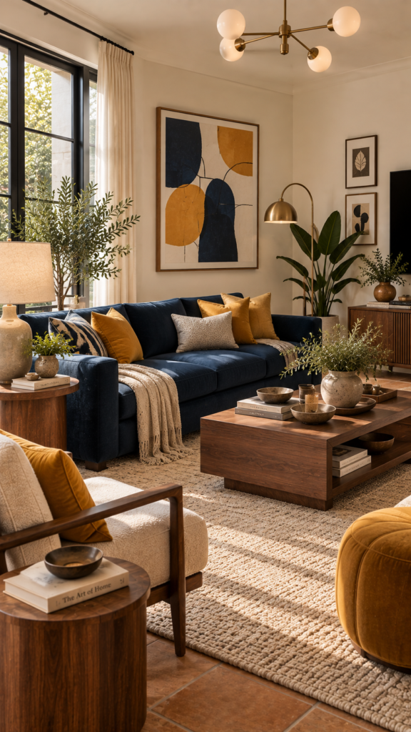
10. Navy + Mustard Yellow + Cream
Bold, energetic, and slightly playful, this palette often draws inspiration from mid-century modern design. The use of highly saturated accent colors against deep neutrals creates a high-energy space that remains stylish and organized.
Dominant Color: Cream should serve as your primary background color to prevent the bolder hues from clashing. Cream walls and a cream rug provide the necessary negative space.
Secondary Color: Navy blue brings depth and a touch of formality. A sleek, low-profile navy sofa anchors the room perfectly.
Accent Color: Mustard yellow adds a pop of joy and vintage-inspired charm.
Keep the mustard yellow tightly controlled. A pair of mustard yellow throw pillows, a ceramic table lamp, or an abstract canvas painting containing bold yellow geometric strokes is all you need to make this palette work.
Styling Tip: Use warm walnut wood tones for your media console and side tables. The dark wood pairs beautifully with the navy blue and grounds the bright yellow.
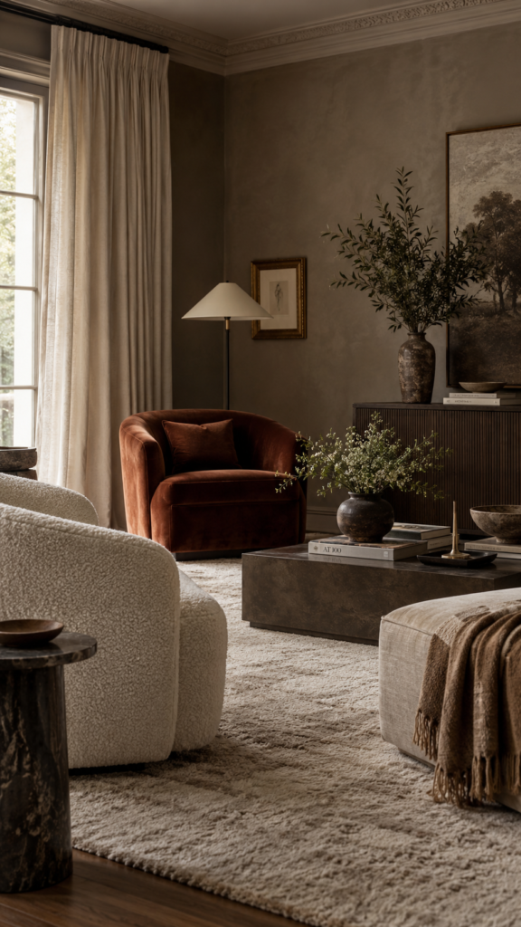
11. Taupe + Rust + Ivory
This combination is all about quiet luxury and sophisticated warmth. It focuses on subtle tone variations and high-quality materials rather than loud colors. It stands out as one of the most elegant living room color schemes available.
Dominant Color: Taupe walls provide a moody but warm foundation that feels much more intentional and layered than standard white or beige.
Secondary Color: Ivory adds necessary brightness. Use heavy ivory linen curtains, an ivory boucle chair, and an oversized plush rug to soften the taupe.
Accent Color: Rust brings a muted, earthy warmth that feels mature and refined without demanding too much attention.
Introduce rust gracefully through a single velvet accent chair, a textured throw blanket draped over the sofa, or subtle patterns in a faded area rug. Allow the textiles to speak for themselves.
Styling Tip: Layer different shades of taupe and ivory in your room’s fabrics. Combining a flat-weave taupe blanket with a fluffy ivory pillow creates visual interest through texture rather than bright color.
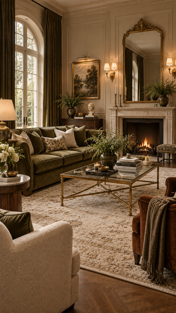
12. Olive Green + Beige + Brass
Grand, established, and historical, this palette relies on classic traditional tones mixed with bright metallic highlights. It balances the heavy saturation of the green with highly reflective surfaces.
Dominant Color: Beige serves as a classic, warm background. Use a beige paint with warm yellow or pink undertones to keep the room feeling cozy.
Secondary Color: Olive green adds a rich, formal feel. An olive green velvet sofa or floor-to-ceiling olive drapes will instantly transform the space.
Accent Color: Brass introduces a touch of glamour and reflects light around the room, breaking up the heavy fabrics.
You can weave brass into the design through a large ornate mirror over the fireplace, brass wall sconces, or the base of a glass coffee table. The metallic finish cuts through the warm beige beautifully.
Styling Tip: Mix modern silhouettes with traditional colors. Place a classic olive sofa next to a sleek, contemporary brass reading lamp to achieve a perfectly balanced transitional look.
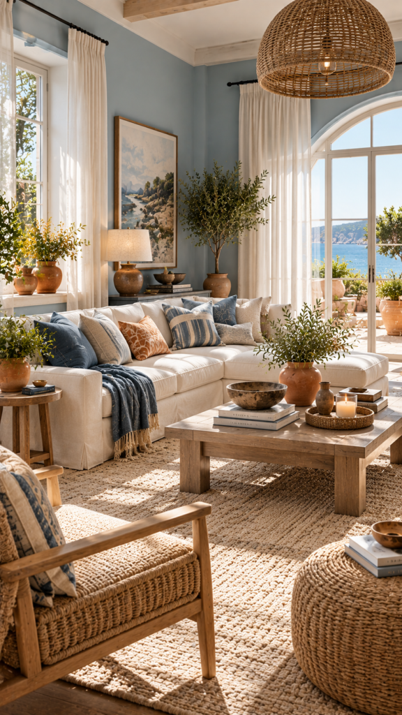
13. Soft Blue + Terracotta + Natural Wood
Breezy, relaxed, and perfectly balanced, this palette balances cool oceanic tones with warm, baked earth colors. It is an excellent example of using a cool receding background to highlight warm foreground elements.
Dominant Color: Soft blue on the walls creates a cool background that pushes visually away from the eye, making the living room feel larger and more open.
Secondary Color: Natural wood adds a rustic, grounding element. Think light driftwood tones, pale oak, and woven seating.
Accent Color: Terracotta provides a surprising pop of warmth that perfectly complements the cool blue walls.
Use terracotta for small accent pieces—a cluster of clay pots on the window sill, a patterned throw pillow, or the base of a table lamp. Keep your fabrics light and breezy, using plenty of loose cotton.
Styling Tip: Leave your windows relatively bare or use very sheer white curtains. This color combination relies heavily on maximizing natural sunlight to make the soft blue feel luminous.
14. Charcoal + Cream + Camel
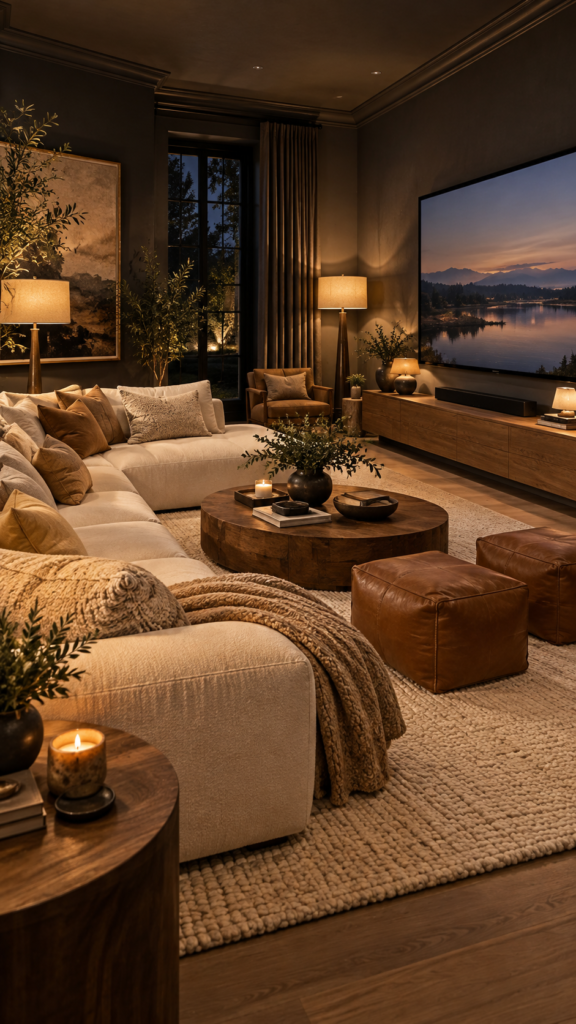
Highly textured, dramatic, and cozy, this palette uses deep values to create a sense of enclosure. It is a brilliant choice for a dedicated TV room or an evening lounging space where comfort is the primary goal.
Dominant Color: Charcoal gray walls create a moody, wrap-around effect. Do not be afraid to paint the trim to match for a seamless, modern look.
Secondary Color: Cream prevents the room from feeling entirely dark. A large cream-colored sectional and a bright cream rug will pop vividly against the charcoal walls.
Accent Color: Camel brings the necessary warmth to keep the high-contrast space from feeling cold or uninviting.
Add camel leather poufs, wooden picture frames in warm oak, and camel-colored throw pillows on the cream sofa. The sharp contrast makes the room feel highly designed and intentional.
Styling Tip: Lighting is crucial in a dark room. Use multiple light sources, including floor lamps and table lamps with warm-toned bulbs, to cast a cozy glow against the dark charcoal walls.
15. Warm White + Burgundy + Walnut
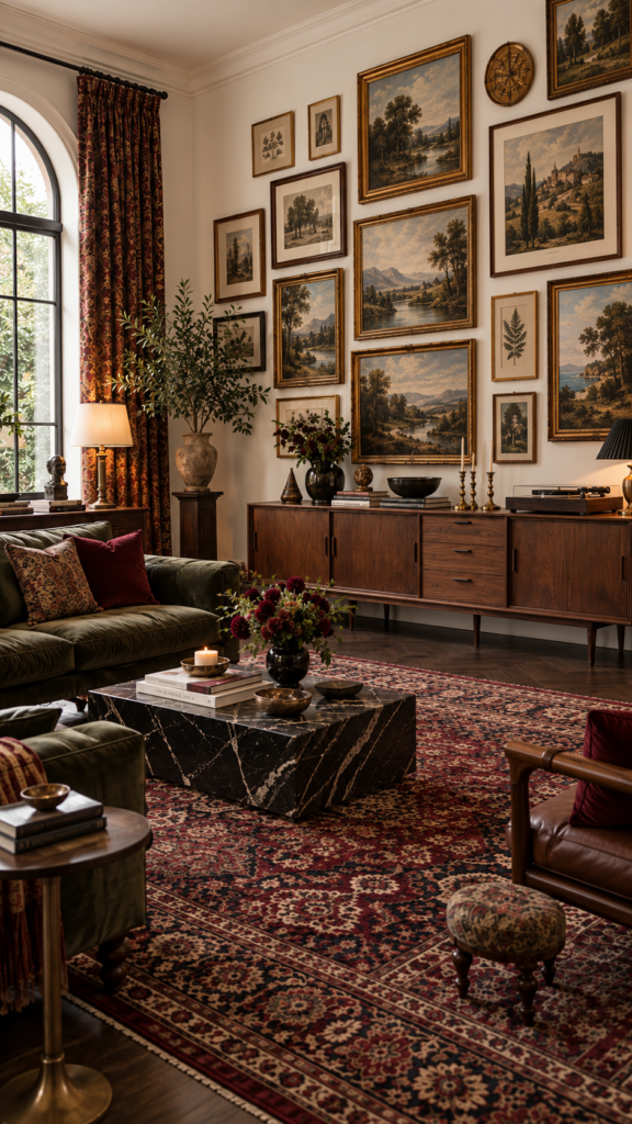
Rich, historic, and sophisticated, this combination uses deep jewel tones mixed with bright, open spaces. This palette feels collected, highly personal, and undeniably elegant.
Dominant Color: Warm white walls provide a bright, gallery-like background. This light base ensures the dark woods and rich reds do not overwhelm the space.
Secondary Color: Walnut wood tones bring a sense of mid-century or traditional elegance. A long walnut credenza and dark wood floors provide a strong foundation.
Accent Color: Burgundy adds a layer of romantic, moody color that feels incredibly timeless.
Introduce burgundy through a large, authentic vintage rug as the centerpiece of the room. Pull that color up into the space using deep red velvet cushions, dark floral artwork, or heavy patterned drapes.
Styling Tip: Create a large eclectic gallery wall on the warm white background. Use a mix of walnut frames, brass frames, and colorful art to tie the entire room’s palette together.
How to Choose the Right Living Room Color Combination
With so many beautiful living room color ideas available, narrowing down your choice requires evaluating the specific conditions of your space.
First, observe your natural light. Rooms that face north tend to receive cooler, bluish light. In these spaces, warm living room color schemes—like beige, terracotta, or taupe—help combat the chill. Conversely, south-facing rooms generally get plenty of warm sunlight, allowing you to easily pull off cooler tones like dusty blue, sage green, or deep navy. However, keep in mind that window sizes, surrounding buildings, and the local climate can alter how light behaves in your room.
Next, consider your existing elements. If you are keeping your current flooring or a large sofa, your new palette must work with those items. Identify their undertones. If your sofa has a cool gray undertone, pairing it with cool tones or high-contrast modern living room colors often yields the best results.
Finally, think about the mood you want to create and the ceiling height. Darker colors can make a high-ceilinged room feel cozier, while lighter tones can help a small room feel more expansive.
How to Balance Colors in Your Living Room
Even the most beautiful color palette can fall flat if the colors are not balanced correctly. Interior designers often use the classic 60-30-10 rule as a helpful visual hierarchy to ensure a harmonious color balance throughout the space.
The 60% (Dominant Color): This color sets the stage. Typically, this is your wall color, a large area rug, or a massive piece of furniture. It serves as the primary backdrop for the rest of your design.
The 30% (Secondary Color): This color supports the dominant shade and adds visual interest. You can introduce your secondary color through accent chairs, window curtains, painted accent furniture, or a secondary tone in your flooring.
The 10% (Accent Color): This is your splash of personality. While it takes up the least amount of visual space, the accent color often draws the most attention. Distribute this evenly around the room using throw pillows, artwork, vases, lampshades, and small decorative accessories.
Remember that this is a flexible guideline, not a strict mathematical rule. The proportions can shift depending on your room’s layout and the specific colors you choose.
How to Test a Living Room Color Palette Before Committing
Before you invest in gallons of paint or order a custom sofa, it is crucial to test your colors in the actual room.
- Test paint on multiple walls: Light hits every wall differently. A color that looks beautiful near the window might look muddy in the dark corner of the same room.
- Observe throughout the day: Check your samples in the bright morning light, the warm afternoon sun, and the dim evening light.
- Check against artificial lighting: Turn on your lamps and overhead lights at night. LED and incandescent bulbs can drastically change how a color reads, often making colors appear warmer or greener.
- Compare alongside existing furniture: Place your paint swatches directly next to your flooring, sofa, and main wooden furniture to ensure the undertones do not clash.
- Avoid relying solely on screens: Colors look entirely different on a glowing phone or computer screen than they do in real life. Always get physical fabric and paint samples.
Frequently Asked Questions
What is the best color combination for a living room?
The “best” combination depends entirely on your room’s lighting and your desired mood. However, combinations pairing a warm neutral (like warm white or taupe) with an earthy tone (like sage green or rust) are universally flattering and timeless.
How many colors should a living room have?
A core palette of three main colors (dominant, secondary, and accent) is ideal for maintaining a cohesive look. You can add depth by using different shades and tints of those three core colors rather than introducing completely new hues.
What colors make a living room feel warm and inviting?
Colors with red, orange, or yellow undertones create warmth. Beige, terracotta, camel, rust, chocolate brown, and warm creamy whites are excellent choices for creating a cozy, inviting atmosphere.
What colors make a living room look brighter?
Light-reflective colors such as crisp warm white, soft cream, pale gray, and pastel tones (like soft blue or pale sage) help bounce natural light around the room, making it feel brighter and larger.
Can I use dark colors in a small living room?
Yes. While dark colors don’t reflect light, using deep shades like charcoal or forest green in a small room can create a highly intentional, jewel-box effect. This approach embraces the small size to create an intimate, cozy space.
How do I choose a living room color palette?
Start by looking at the items you already own and cannot change, like flooring or large furniture. Identify their undertones, then select a dominant wall color that complements them. Finally, choose an accent color based on artwork or a rug you love.
What is the 60-30-10 color rule?
It is a classic design guideline for balancing color. Approximately 60% of the room should be your dominant background color, 30% should be your secondary supporting color, and 10% should be a bolder accent color.
Conclusion
Designing a space you genuinely love starts with finding the right foundational hues. By exploring these 15 living room color combinations, you have the inspiration and practical knowledge to create a room that matches your unique style. Whether you lean toward the quiet calm of soft gray and blush pink, or the rich, tailored depth of navy blue and camel, the secret to success is thoughtful balance.
Remember to let one color dominate, support it with a complementary secondary shade, and use your accent colors strategically to add personality. Take the time to test your paint colors, consider your natural light, and start building a beautiful, welcoming living room today.