20 Boho Color Palette Ideas to Transform Your Home Interior
Choosing the right boho color palette sets the foundation for a warm, inviting, and personalized home. Bohemian interior design thrives on creative freedom, mixing eclectic patterns, and layering natural textures. Rather than adhering to strict, minimalist rules, this style encourages you to express your personality through your choice of hues. Whether you prefer a modern boho color palette or a more traditional, globally inspired look, finding the right mix of shades is essential for a cohesive space.
In this guide, we explore a wide variety of bohemian palettes, including earthy, neutral, moody, coastal, romantic, tropical, modern, and jewel-toned options. From an earthy boho color scheme grounded in clay and sand to rich, contrasting jewel tones, these 20 curated ideas will help you determine how to choose boho colors that elevate your home’s interior.
How to Build a Boho Color Palette
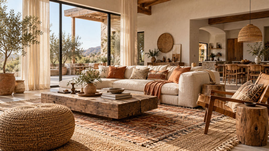
Before diving into specific shades, it helps to understand the anatomy of the best boho color combinations. A simple, practical approach is to select a neutral or earthy base, add a secondary color for depth, introduce a stronger accent, and finish the space with natural materials and textures. This formula ensures your room feels layered rather than chaotic.
Keep in mind that boho design does not require every room to be highly colorful. Neutral, muted, and dark boho palettes can feel just as expressive as vibrant ones. Often, the true character of a space emerges from how you blend subdued hues with raw wood, woven rattan, and tactile textiles.
1. Desert Terracotta and Warm Sand
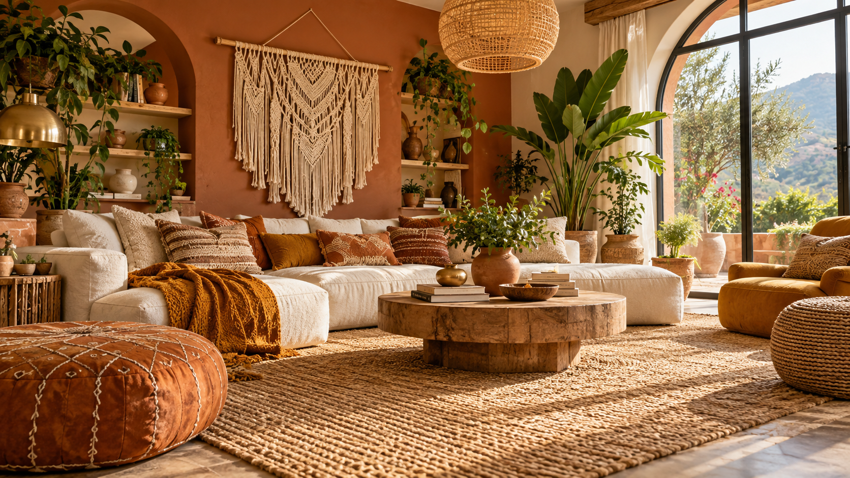
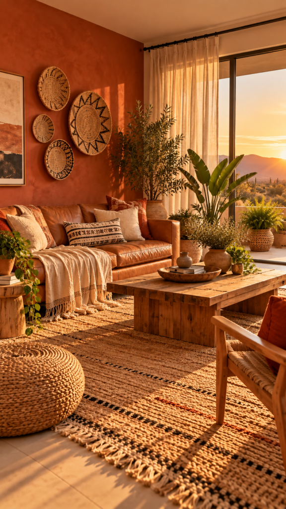
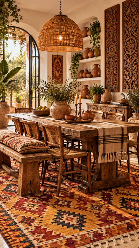
A Terracotta Color Palette brings the warmth of sun-baked earth directly into your home. This combination relies on warm sand as a dominant base, supported by a secondary layer of muted burnt oranges and rusty clay. A subtle accent of desert green—often introduced through live plants—completes the look.
To ground these shades, incorporate plenty of natural materials. A large jute rug, light oak wood furniture, and woven wall baskets complement the earthy tones. For textiles, choose raw cotton throws and linen pillows in matching sandy shades to maintain a bright, open atmosphere.
Best for: Living rooms and large gathering spaces.
2. Sage Green and Natural Rattan
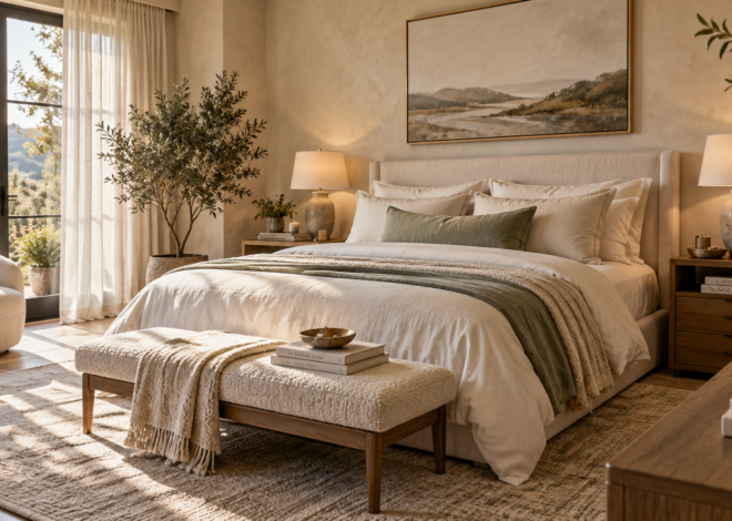
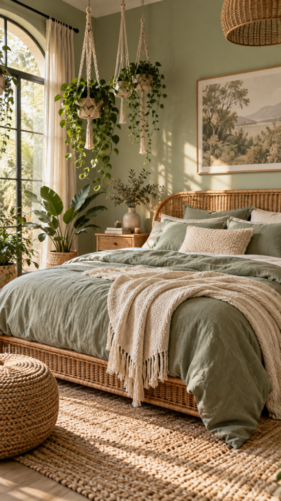
If you prefer a softer environment, an Earthy Color Palette featuring sage green is an excellent choice. Ivory or off-white serves as the airy base, while sage green acts as the secondary color. The golden-brown hues of natural rattan provide an organic accent that mimics the outdoors.
Bring this concept to life by prioritizing light fabrics and woven shapes. A rattan bed frame or a cane sideboard serves as an ideal anchor piece. Layer sage green linen bedding with ivory throw blankets to build subtle contrast, and hang macrame planters to introduce vertical greenery.
Design Tip: Paint your walls a soft sage green and hang a large, round rattan mirror opposite a window to bounce natural light around the room.
3. Creamy White and Bleached Wood
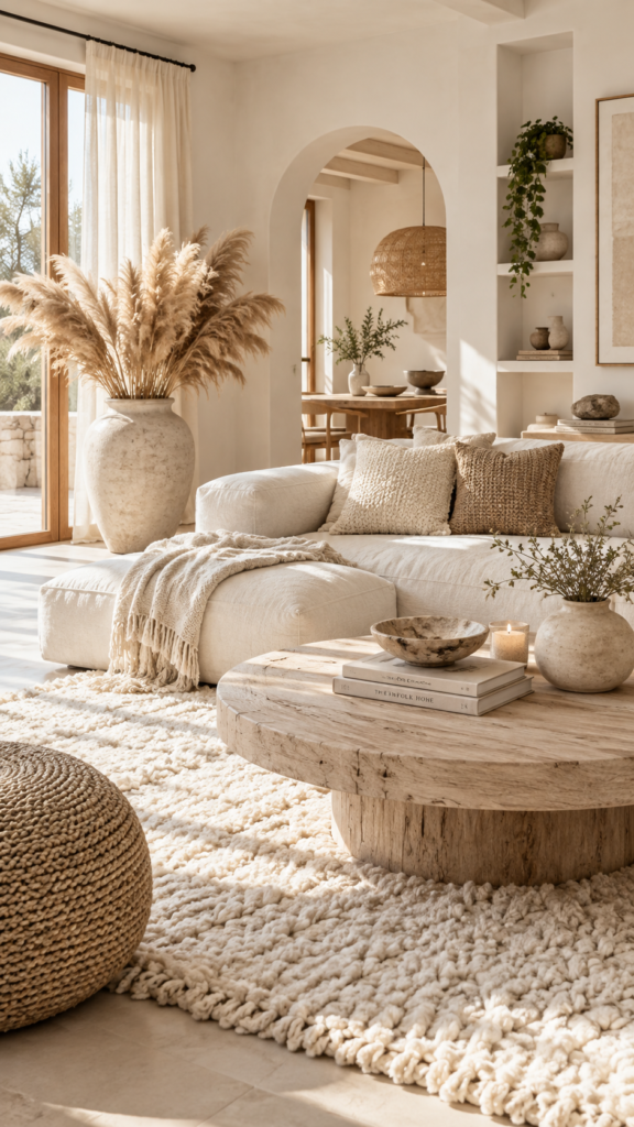
For those who love a cleaner, minimalist approach, a Warm Neutral Color Palette bridges Scandinavian and bohemian styles. Creamy white acts as the dominant foundation, supported by secondary ivory tones. Pale, bleached wood serves as the subtle accent, keeping the contrast exceptionally low.
Because the color variation is minimal, texture must carry the design. Mix tufted area rugs, chunky knit blankets, and smooth ceramic vases. Dried pampas grass placed in a large floor vase adds necessary height and organic texture without breaking the neutral scheme.
Best for: Small apartments or spaces with limited natural light, as the whites help reflect available sunshine.
4. Mustard Yellow and Dusty Charcoal
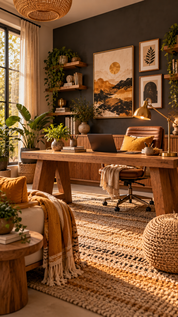
When reviewing different Boho Color Schemes, contrasting colors often yield striking, memorable spaces. In this arrangement, dusty charcoal grey provides a sophisticated, grounded base. Mustard yellow serves as an energetic secondary tone, while brass or gold metals act as polishing accents.
Balance these tones by reserving charcoal for larger surface areas, such as an area rug or an upholstered sofa. Introduce mustard yellow deliberately through accent pillows, textured throws, and framed artwork. Metallic brass reading lamps will highlight the warmth in the yellow fabrics.
Design Tip: A charcoal accent wall behind a warm oak desk creates a polished, professional boho aesthetic that works well in creative home offices.
5. Midnight Blue and Warm Ochre
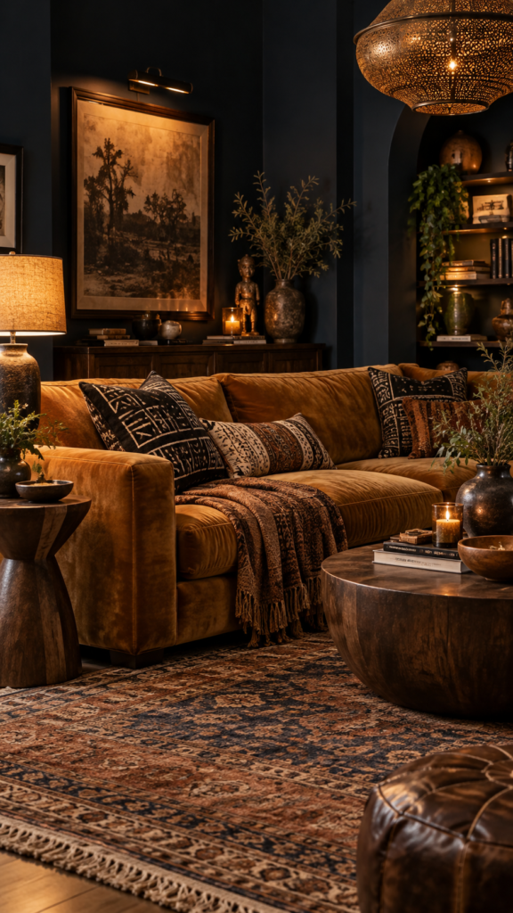
A classic Bohemian Color Palette frequently embraces dark, moody tones alongside rich spices. Midnight blue offers an immersive, luxurious base. Warm ochre—a deep, golden-brown yellow—acts as a rich secondary hue, while dark walnut wood serves as the grounding accent.
Rich, tactile fabrics elevate this combination. A midnight blue velvet sofa instantly anchors the room. Dress it with ochre mud-cloth pillows and a heavy woven blanket. When selecting side tables or shelving, dark walnut complements the moody aesthetic much better than light ash or pine.
Best for: Formal living rooms, media rooms, or home libraries.
6. Washed Denim and Warm Clay
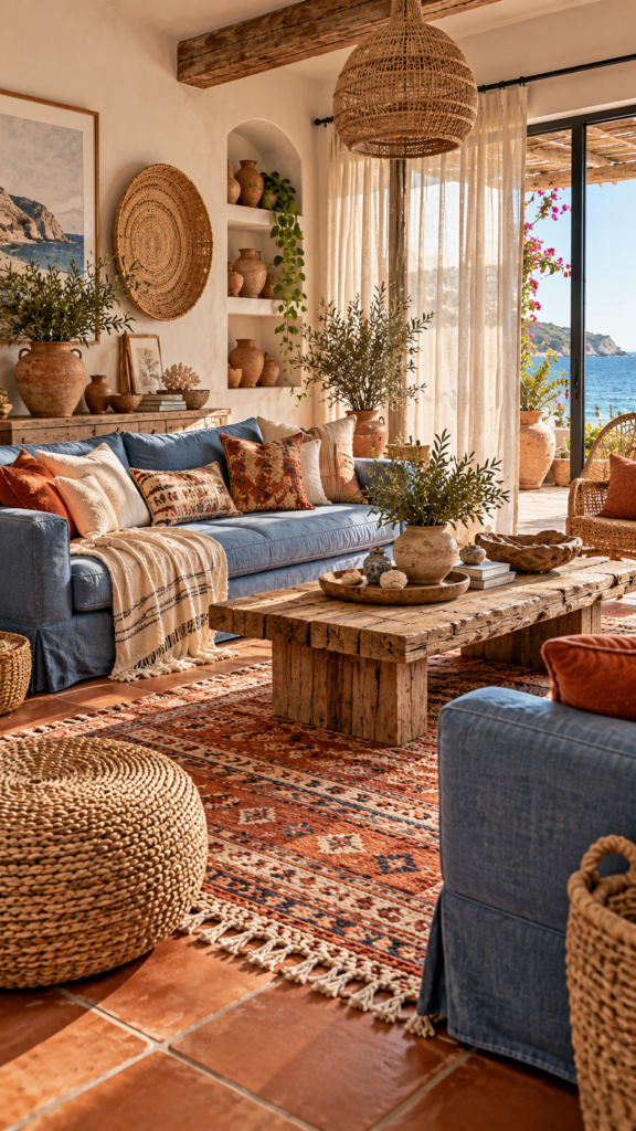
When considering Boho Living Room Colors, coastal-inspired design offers a relaxed alternative. Washed denim blue serves as an airy, cooling base, paired with warm clay as a secondary color. Elements of sea-grass and driftwood provide the necessary organic accents.
Maintain an informal layout with your furniture. Slipcovered linen sofas in soft grey-blue establish comfortable seating. Introduce clay tones via terracotta floor tiles, ceramic table lamps, or rust-colored vintage runners. Woven sea-grass baskets enhance the breezy, shoreline aesthetic.
Design Tip: Keep window treatments light and sheer to maximize daylight, allowing the soft blue tones to feel expansive rather than enclosed.
7. Dusty Pink and Copper Accents
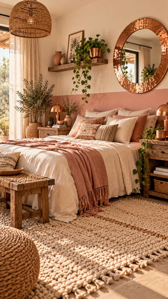
For a slightly softer approach to Boho Home Decor Colors, combine dusty pink with metallic copper. Off-white or soft cream acts as the foundational base, allowing dusty pink to serve as a muted secondary tone. Shiny copper hardware provides a refined vintage accent.
Balance the inherent sweetness of pink by incorporating raw, unpolished materials. Use rough-hewn wooden side tables and thick, woven wool rugs. Hang a copper-framed mirror on the wall, and utilize copper planters for trailing vines like pothos or ivy.
Best for: Guest bedrooms, nurseries, or soft, welcoming entryways.
8. Burnt Orange and Deep Burgundy
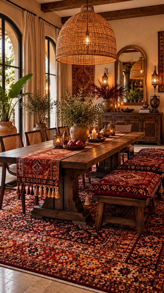
To cultivate a space that feels deeply layered and historical, look toward rich autumnal hues. Deep burgundy establishes a robust base, while burnt orange acts as a vibrant secondary tone. Dark mahogany or mango wood provides the grounding accent in this traditional boho palette.
The most effective way to introduce this combination is through a large, vintage Persian or Turkish area rug. Pair the rug with rich wood dining or coffee tables. Floor cushions covered in burgundy kilim fabrics offer casual, low-profile seating that aligns with bohemian ideals.
Design Tip: Suspend an oversized woven rattan pendant light over a solid wood table to balance the heavy, dark colors with a lighter, airy texture.
9. Coffee, Caramel, and Cream
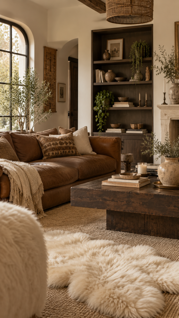
Monochromatic gradients create highly sophisticated interiors when paired with varied textures. Cream serves as a bright, expansive base, caramel acts as an inviting secondary color, and dark coffee brown provides a defining accent that prevents the room from feeling flat.
Start with cream-colored walls to keep the environment well-lit. Position a caramel-toned leather sofa at the center of the room, as the material ages gracefully. Utilize dark coffee-colored wood for shelving units and coffee tables.
Best for: Family living rooms where durable leather and dark woods meet the softness of cream textiles.
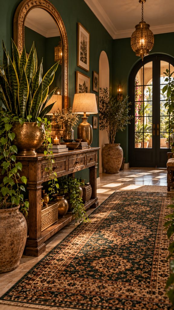
10. Emerald Green and Antique Brass
If you want to merge bohemian styling with an element of vintage luxury, explore Boho Interior Design through jewel tones. Emerald green acts as a lush, saturated base. Antique brass serves as the elegant secondary tone, while dark vintage textiles provide subtle accents.
Apply emerald green to the walls or through substantial upholstered pieces, like a tufted velvet armchair. Antique brass should appear functionally in your hardware, including drawer pulls, curtain rods, and floor lamps. Lay down a dark vintage rug with green undertones to anchor the aesthetic.
Design Tip: Place a brass console table against a dark green wall and top it with an oversized snake plant to bridge the gap between organic nature and vintage glamour.
11. Peach, Cream, and Olive
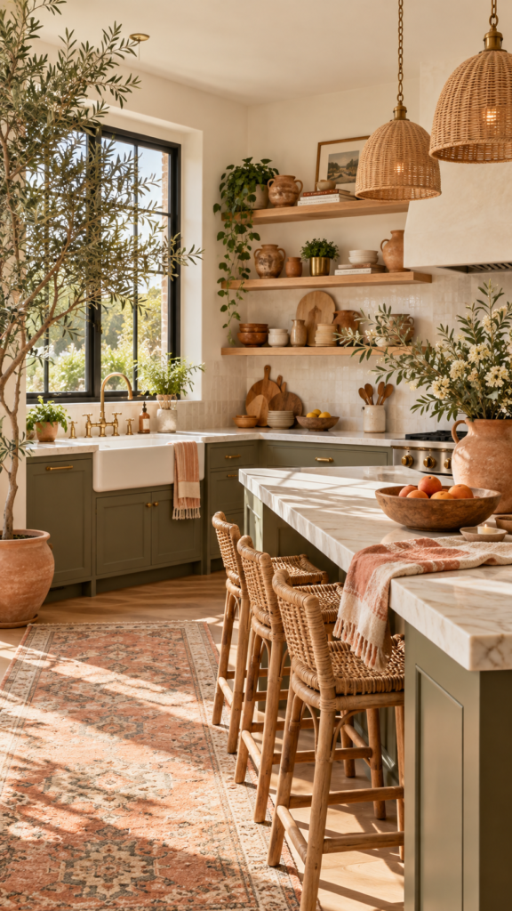
For a cheerful, sunlit environment, blend a cream base with soft peach as your secondary color and earthy olive green as the grounding accent. This combination feels optimistic and fresh, relying on the olive tones to keep the peach from leaning overly pastel or sweet.
Keep your largest furniture pieces in cream or soft ivory. Reserve peach for painted accent walls, throw pillows, and window valances. Introduce olive green primarily through live indoor greenery, such as an olive tree in a terracotta pot, or through glazed ceramic tableware.
Best for: Boho kitchens and bright dining areas where you want an energized yet earthy feel.
12. Charcoal, Amber, and Ivory
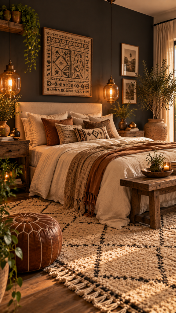
When searching for the best Boho Bedroom Colors, a moody palette often provides an ideal retreat. Charcoal grey acts as the dominant backdrop. Ivory lightens the visual load as the secondary color, while amber adds a warm, glowing accent.
Start with a charcoal feature wall behind the headboard. Use natural ivory linen bedding to establish a crisp, tactile contrast against the dark paint. Incorporate amber through vintage glass pendant lights and rust-toned decorative throw pillows.
Design Tip: Charcoal grey creates a visually quieter backdrop, giving the bedroom a more intimate and restful feel . Keep the floor soft with a textured ivory Berber rug.
13. Eucalyptus and Soft Gray
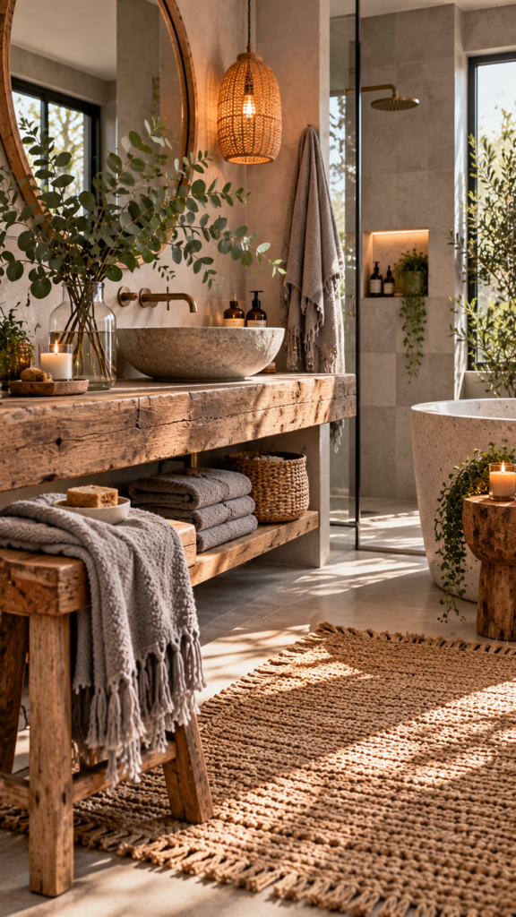
Bohemian styling accommodates cool tones beautifully when matched with appropriate textures. Soft dove gray operates as the neutral base, eucalyptus green provides a dusty, silver-toned secondary layer, and weathered reclaimed wood serves as the rustic accent.
Texture is vital to keep this cool palette from feeling sterile. Utilize weathered wood for open shelving or vanity stools. Display fresh eucalyptus branches in clear glass vases, and choose plush, soft gray cotton towels paired with a braided bath mat.
Best for: Bathrooms and washrooms, offering a nature-inspired, spa-like aesthetic.
14. Saffron, Rust, and Bone
Channel the vibrancy of global travel with a spice-inspired palette. Bone-white acts as a muted, calming base. Saffron yellow and rust red share the role of energetic secondary colors, while heavily textured carved wood provides the accent.
Mix patterns fearlessly within this scheme. A kilim rug featuring geometric shapes sets the foundation. Rely on bone-white for your walls and large upholstered items to give the eye a visual resting place. Decorate with carved wooden panels and richly textured wall art.
Design Tip: Display rust-colored terracotta bowls and saffron-tinted glassware on open floating shelves to integrate color directly into your kitchen storage.
15. Indigo and Woven Jute
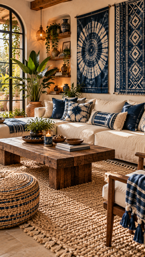
For a casual, globally influenced layout, pair deep indigo blue with the natural tan of woven jute. A canvas white or light tan serves as the base, indigo acts as a striking secondary color, and the rough, golden texture of jute provides the organic accent.
Incorporate shibori or tie-dye indigo throw pillows onto a simple canvas or linen sofa. Position a large, chunky jute rug to cover the main seating area. Indigo-dyed tapestries hung on the walls can act as large-scale, cost-effective artwork.
Best for: Relaxed family rooms, playrooms, or casual lounges.
16. Muted Teal and Faded Coral
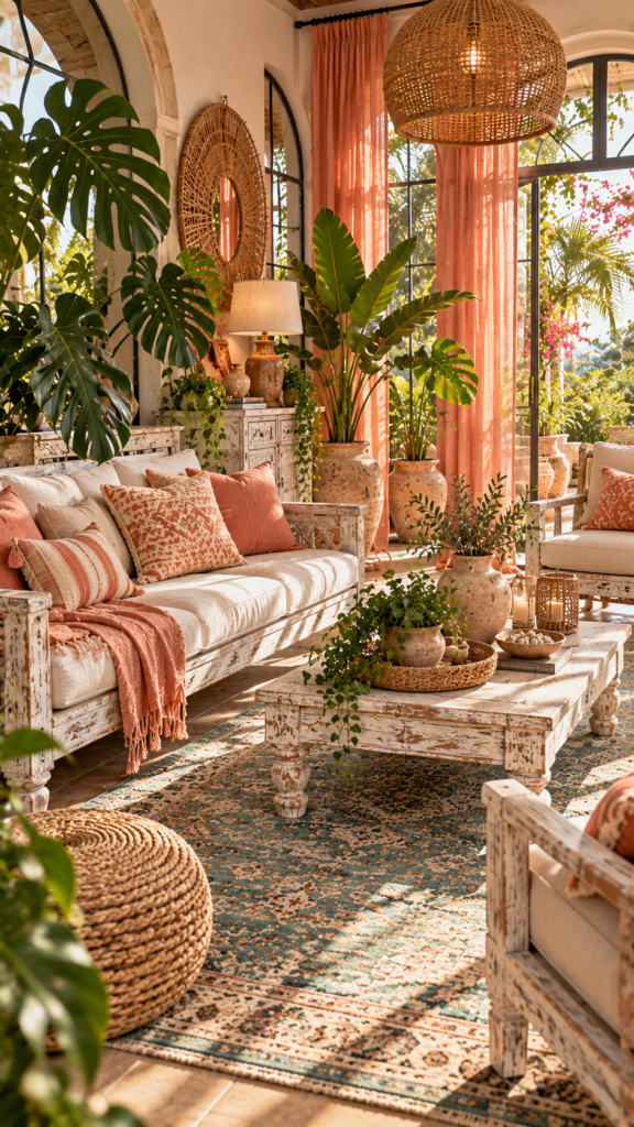
Capture the essence of a tropical sunset with distressed white as your base, muted teal as a calming secondary hue, and faded coral as a playful accent. By keeping the colors muted, the room maintains a vintage, lived-in bohemian feel rather than leaning toward modern coastal.
Distressed white wood furniture enhances the vintage atmosphere. A muted teal rug anchors the floor plan gracefully. Scatter faded coral pillows across your seating arrangements, and utilize sheer coral curtains to filter incoming sunlight.
Design Tip: Fill the space with large, leafy plants like monsteras or birds of paradise to reinforce the tropical aesthetic without adding more paint colors.
17. Plum, Rose, and Vanilla
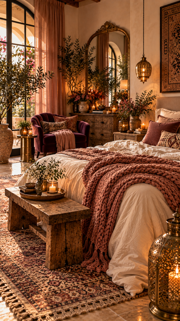
Cultivate a poetic, romantic ambiance by mixing a warm vanilla base with deep plum as a secondary color and dusty rose as a soft accent. This palette explores the mystical, softer side of bohemian decor, where contrasting light and dark tones create visual intrigue.
Prioritize luxurious, tactile fabrics. A plum velvet accent chair immediately draws the eye. Dress your bed with vanilla-colored linen sheets and drape a chunky knit dusty rose blanket at the foot. Incorporate gold or brass mirrors to reflect light and add subtle elegance.
Best for: Main bedrooms and intimate reading corners.
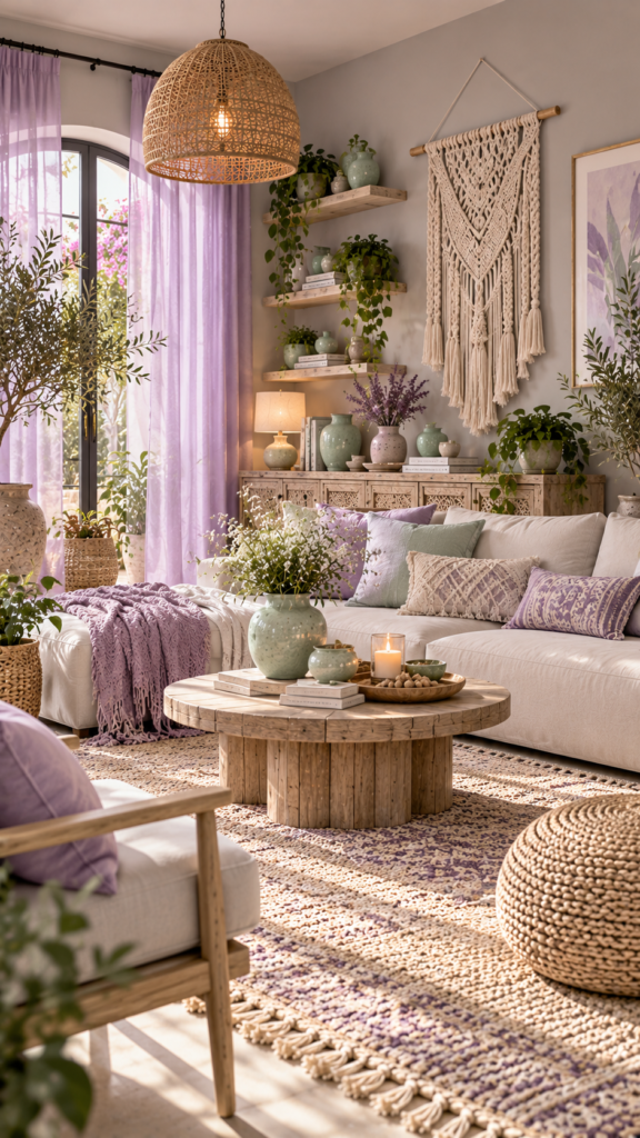
18. Lavender, Mint, and Dove Gray
Pastel colors translate easily into bohemian homes when grounded properly. Dove gray acts as the neutral base, soft lavender serves as a dreamy secondary hue, and fresh mint green functions as the accent. This combination feels airy, whimsical, and creative.
Avoid heavy, dark woods with this palette. Instead, rely on white-washed or light ash wood furniture. Hang sheer lavender canopies or curtains to diffuse natural light softly. Mint green ceramics and planters provide subtle color variations on floating shelves.
Design Tip: Add tactile boho elements like fringed wall hangings or light-toned macrame to give the pastel colors more depth and texture.
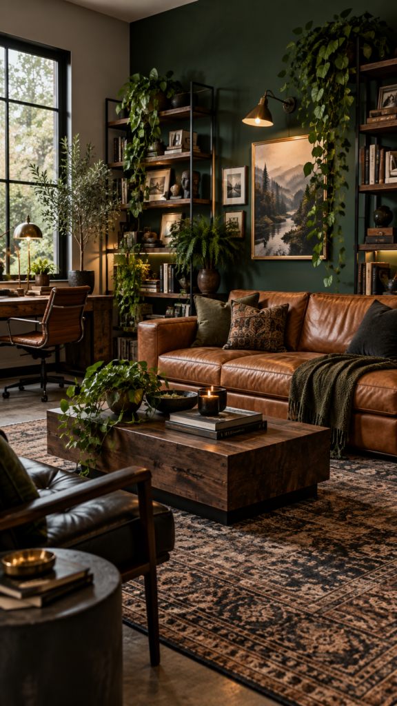
19. Forest Green, Tan, and Black
For an edgy twist on traditional styling, combine deep forest green as the base, warm tan as the secondary color, and matte black as a sharp, modern accent. This palette feels mature and sophisticated, using black as a graphic element to define organic shapes.
Paint a focal wall in rich forest green and place a warm tan leather sofa in front of it to establish strong contrast. Utilize matte black metal for lighting fixtures, picture frames, and shelving brackets. Soften the harsh lines of the metal with cascading indoor vines.
Best for: Modern living rooms, home libraries, or moody studies.
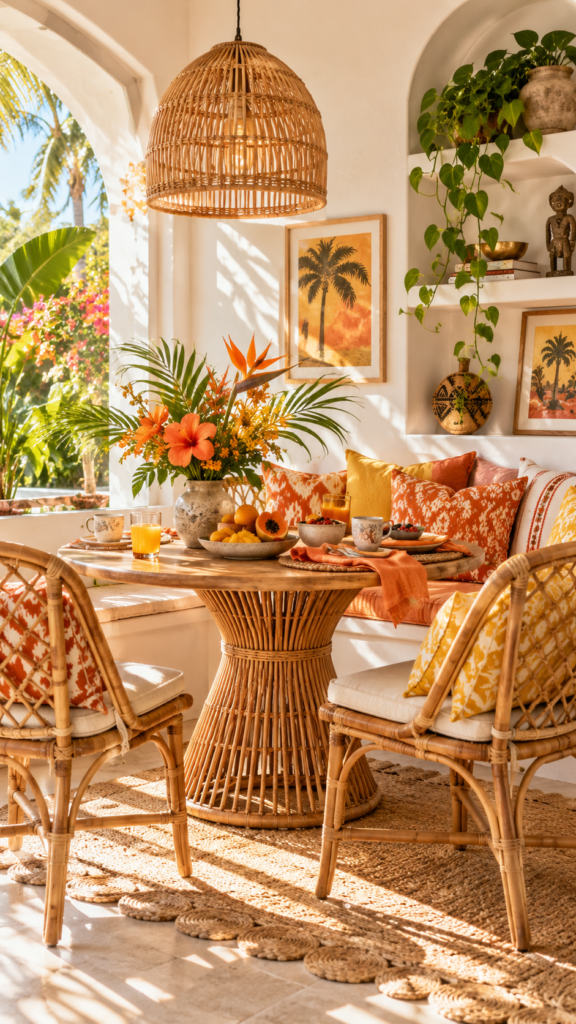
20. Papaya, Marigold, and Chalk White
We conclude with a vibrant, joy-inducing palette. Crisp chalk white provides a clean base, allowing papaya orange to act as a bold secondary color and marigold yellow to serve as the accent. This arrangement leans heavily into a lively, tropical bohemian aesthetic.
Let white dominate the walls and larger furniture pieces to prevent the bright colors from overwhelming the space. Introduce papaya and marigold through patterned textiles, ceramic vases, and artwork. Rattan and bamboo furnishings fit naturally into this bright scheme.
Design Tip: Keep the floor plan relatively uncluttered so the bold, saturated colors have visual room to breathe.
How to Choose the Right Boho Color Palette for Your Home
Selecting boho colors for home interiors involves more than just picking your favorite hues. Consider the natural light in your room. South-facing rooms with abundant sunlight often work well with darker, moodier palettes like midnight blue and charcoal. while north-facing or smaller rooms often benefit from warm neutral colors that reflect light.
Take inventory of the elements you plan to keep. Existing flooring, prominent wood tones, and large furniture pieces should guide your color choices. For example, if you have rich mahogany floors, a palette featuring deep burgundy or forest green will integrate more smoothly than stark, cool grays. Finally, decide if the room is primarily used during the day or the evening, as artificial lighting will change how warm or cool your colors appear.
How Many Colors Should a Boho Room Have?
While boho design celebrates eclecticism, an overly chaotic color scheme can feel visually exhausting. There is no rigid rule, but a cohesive space generally relies on three main color families: a dominant base (often a neutral or soft earth tone), a secondary tone for depth, and one or two controlled accents.
Remember that bohemian interiors derive much of their richness from patterns and textiles. You do not need to introduce a new paint color to make a room feel vibrant. Layering varied textures—like a fringed wool blanket over a smooth leather chair—adds visual weight without cluttering the palette.
Frequently Asked Questions
What colors are considered boho?
Boho palettes often draw from earthy tones such as terracotta, mustard, sage green, and rusty red . Think warm terracotta, mustard yellow, sage green, and rusty reds. Modern bohemian styles also heavily utilize warm neutrals, crisp whites, and deep jewel tones like emerald and navy.
Can a boho color palette be neutral?
Yes. A warm neutral color palette featuring cream, ivory, taupe, and bleached wood is a staple of Scandi-boho design. The key to neutral boho spaces is relying on highly textured materials like jute, macrame, and linen to provide visual interest.
What colors go well with terracotta in boho interiors?
Terracotta pairs exceptionally well with warm sand, muted mustard, and soft sage green. For a higher contrast look, pair terracotta with deep navy blue or matte black to make the earthy orange tones stand out.
What is a modern boho color palette?
A modern boho color palette typically features a crisp, white or light gray base contrasted with bold, graphic accents like matte black or dark charcoal. It incorporates traditional bohemian textures like rattan and leather but keeps the overall color application much cleaner and more structured.
How do you keep a colorful boho room from looking too busy?
To prevent visual clutter, establish a dominant neutral base color for your walls and largest furniture pieces. Confine your brightest colors to easily swappable textiles, artwork, and decorative accessories, and ensure there is plenty of negative space for the eye to rest.
Balancing Color and Texture
A truly successful interior relies on more than just the paint on the walls. The best Bohemian Home Decor Ideas balance color with raw textures, organic materials, considered lighting, and meaningful personal objects. Rather than rigidly following design rules, use these 20 concepts as a foundation to build a space that feels authentic to your lifestyle.
Before committing to a major change, always test paint swatches and fabric samples in your actual room. Observe how the light hits them in the morning and the evening. By taking the time to see how materials and hues interact in your specific space, you will confidently create a bohemian home that is both expressive and enduringly comfortable.
Related Posts
How to Mix Modern and Vintage Furniture Successfully
10 Kitchen Color Combinations to Try