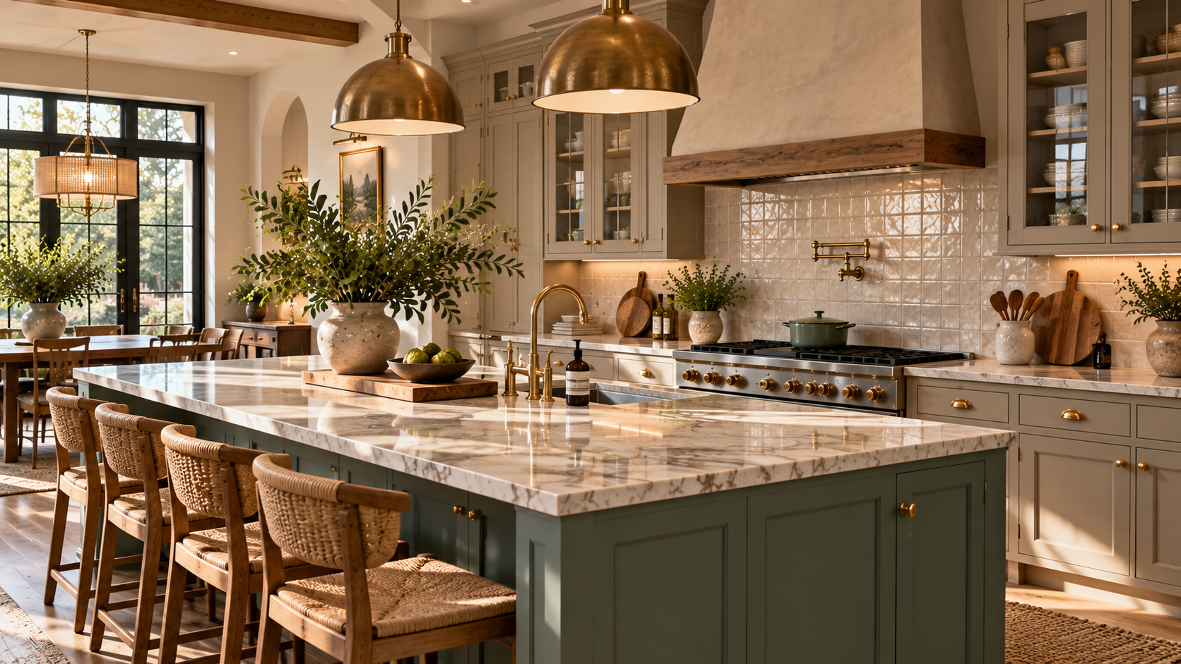
10 Kitchen Color Combinations to Try
Choosing the right Kitchen Color Combinations can completely redefine the heart of your home. Whether you are planning a full-scale renovation or updating your current space with new paint and hardware, the colors you select dictate the mood, style, and perceived size of the room. A well-planned palette brings harmony to the space, bridging the gap between cabinetry, countertops, flooring, and architectural details.
Modern interior design has moved beyond the standard all-white kitchen. Today, homeowners and designers are embracing depth, texture, and character through diverse Kitchen Color Ideas. From the grounded, earthy tones of Organic Modern spaces to the crisp, tailored contrasts of Transitional design, there is a color pairing to suit every architectural style and personal preference.
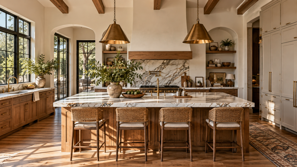
This guide explores 10 distinct, highly practical color palettes. We will break down exactly how to distribute these colors across your cabinets, walls, backsplashes, and countertops to create a cohesive look. Whether your kitchen benefits from abundant south-facing light or you need to brighten up a compact footprint, these expert-approved pairings offer versatile solutions for every layout.
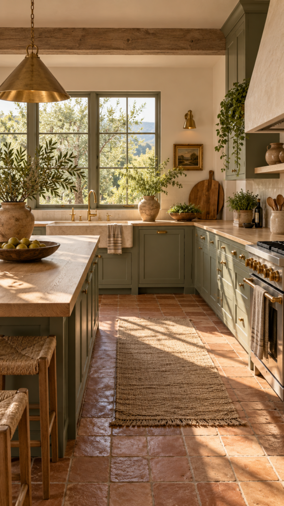
1. Sage Green and Warm Terracotta (Organic Modern)
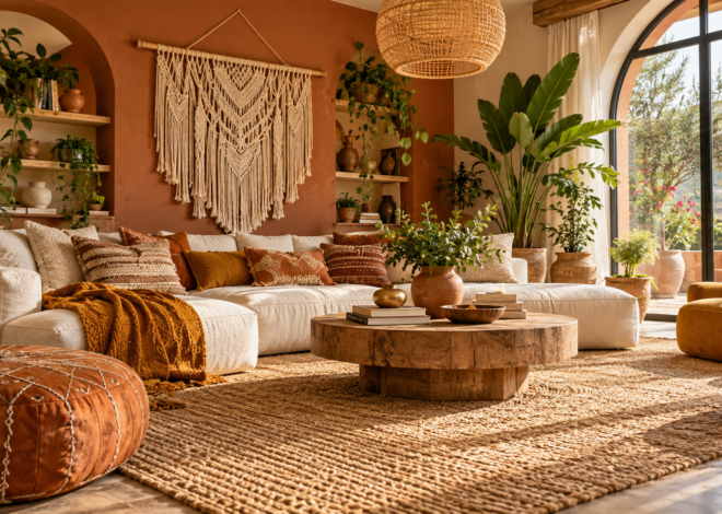
Rooted in natural landscapes, the pairing of muted sage green and warm terracotta has become a staple of Organic Modern and Mediterranean-inspired interiors. The coolness of the sage creates a calming baseline, while the baked-earth tones of terracotta introduce inviting, tactile warmth.
Why This Earthy Palette Works
This combination excels because it relies on complementary color theory without feeling overwhelming. Sage green acts almost as a neutral, adapting seamlessly to changing natural light throughout the day. Terracotta grounds the space, adding visual weight and historical character that prevents modern kitchens from feeling sterile.
Best Cabinet Finishes and Countertop Pairings
Apply sage green as the dominant color on your kitchen cabinets, opting for a matte or eggshell finish to keep the look understated. To balance the green, introduce terracotta through natural clay floor tiles or a handmade zellige tile backsplash. Pair these Kitchen Cabinet Colors with honed quartzite or light oak countertops to maintain the organic, unpolished aesthetic. Warm brass or unlacquered brass hardware bridges the gap between the cool cabinets and the warm flooring.
Design Tip: If you are working with a kitchen that receives low natural light, limit terracotta to smaller accents like a backsplash or woven rugs, keeping the floors and walls a lighter cream to reflect available light.
2. Matte Black and Natural Wood (Japandi)
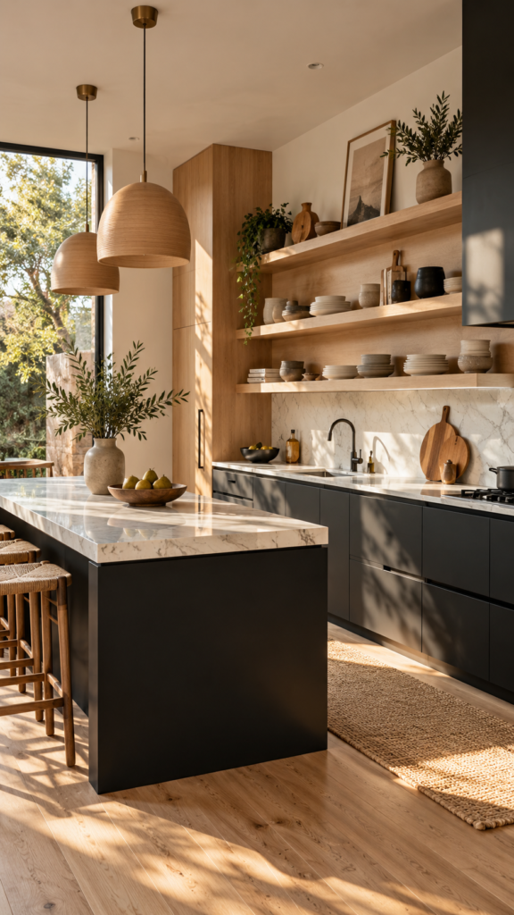
For those drawn to sleek, architectural spaces, combining matte black with natural wood tones offers a refined take on contemporary and Japandi design. This high-contrast palette is about balancing shadow and warmth, creating a kitchen that feels highly intentional and sophisticated.
Striking the Right Balance
Black can absorb light, which is why it requires a warm, reflective counterpart like natural white oak, ash, or walnut. The wood tones soften the severity of the black, bringing an essential human element into a minimalist framework.
Material Choices and Hardware
This is an ideal scenario for Two Tone Kitchen Cabinets. Anchor the room by using matte black on the lower cabinets or the central kitchen island. Keep the upper section visually lighter by incorporating natural wood open shelving or flat-panel wood upper cabinets. A bright white quartz or marble countertop with subtle veining provides a crisp visual break between the dark base and the wood uppers. Hardware should be kept minimal—think edge-pulls in matte black or brushed nickel.
Design Tip: When using matte black cabinetry, invest in high-quality, fingerprint-resistant finishes to maintain a clean, elevated appearance with minimal daily upkeep.
3. Blush Pink and Emerald Green (Eclectic)
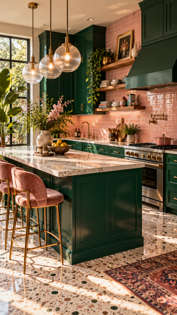
If you want your kitchen to showcase bold personality, mixing blush pink with rich emerald green delivers a striking, Art Deco-inspired aesthetic. The pink serves as a soft, unexpected neutral, allowing the jewel-toned green to command attention.
How to Distribute the Colors
Because emerald green is highly saturated, it works best as the grounding color for your primary cabinetry. Use blush pink as the secondary color on the walls above the backsplash or as the backsplash itself using glossy ceramic subway tiles. The subtle warmth of the pink prevents the dark green from feeling too heavy or traditional.
Lighting and Accent Details
To elevate this combination, incorporate brushed brass or polished gold hardware, which pops beautifully against the dark green. Fluted glass cabinet fronts or statement globe pendant lights enhance the eclectic, curated atmosphere. Stick to lighter flooring, such as a pale terrazzo or whitewashed wood, to ensure the room remains airy.
Design Tip: When using bold Kitchen Paint Colors on cabinetry, keep the countertop profiles simple and clean. A plain white solid surface or subtle marble ensures the colors remain the focal point without creating visual clutter.
4. Cream and Mustard (Modern Farmhouse)
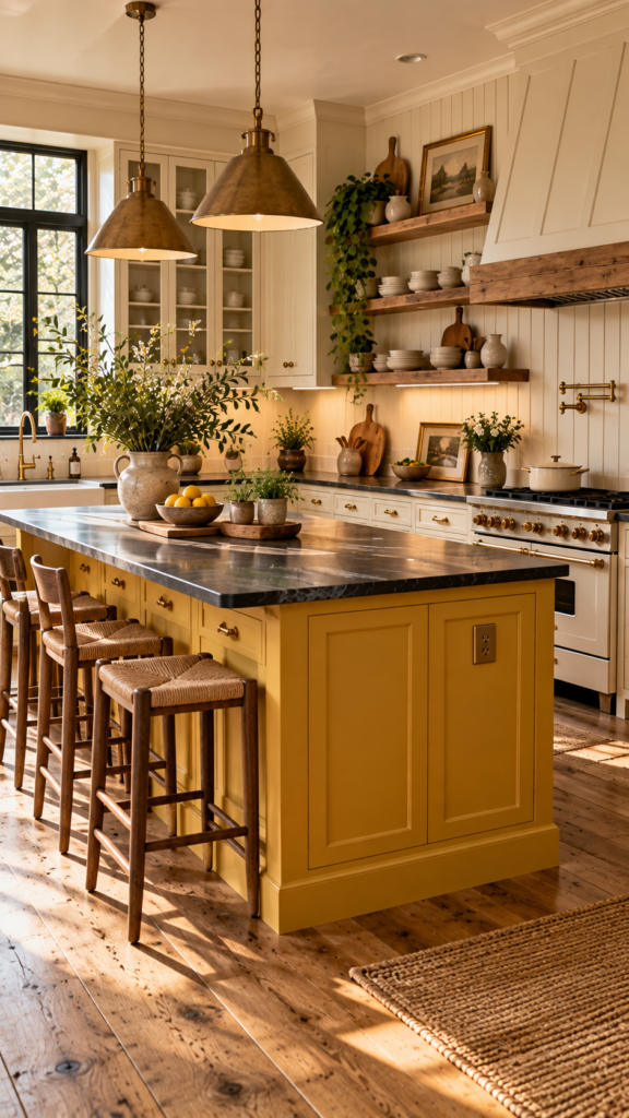
Moving away from stark whites, a palette of creamy off-white and muted mustard yellow brings a cheerful, inviting energy reminiscent of English cottages and Modern Farmhouse interiors. It is an approachable, comforting scheme that relies on texture and warmth.
Achieving the Cottage Aesthetic
When evaluating Neutral Kitchen Colors, a warm, creamy white offers far more depth than a standard builder-grade white. Apply this cream tone to the perimeter cabinets, walls, and trim to create a seamless, expansive feel. Introduce mustard yellow purposefully on a freestanding pantry cupboard, the kitchen island, or a patterned floor tile to create a defined focal point.
Backsplash and Flooring Recommendations
Enhance the farmhouse charm by installing a vertical beadboard backsplash painted in the same cream as the upper cabinets. Soapstone countertops or chunky butcher block surfaces pair naturally with mustard and cream, grounding the lighter tones. Opt for distressed hardwood planks or a classic checkerboard floor to complete the lived-in, heritage feel.
Design Tip: Mustard yellow can be dominant. To keep it tasteful, use it on a single architectural element (like an island or base cabinets) and surround it with ample cream and warm wood tones.
5. Navy Blue and Brass (Transitional)
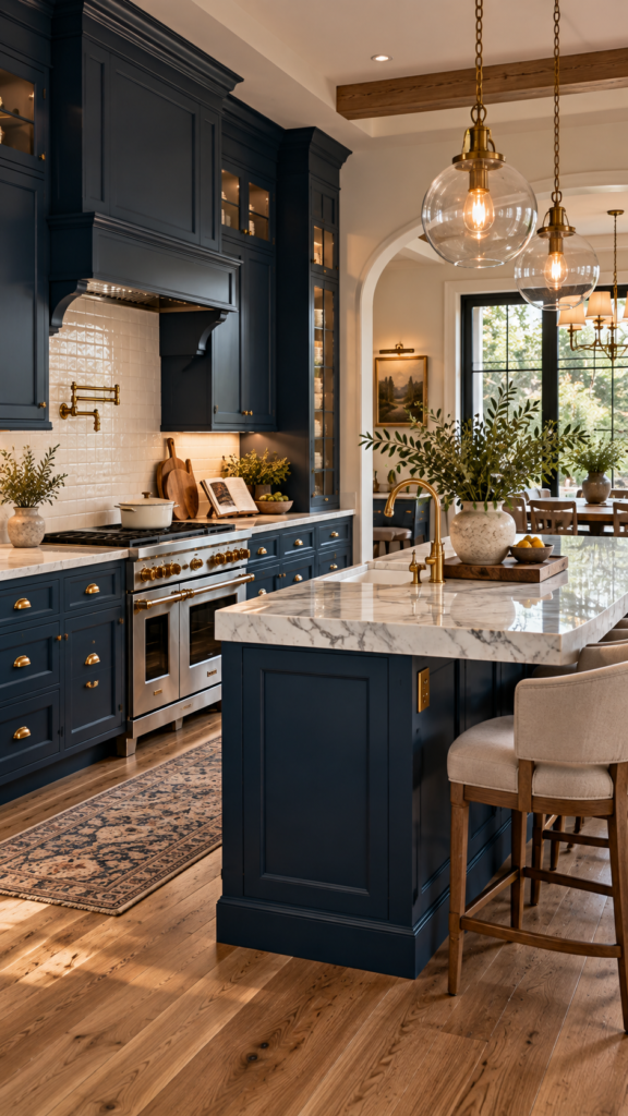
Navy blue has firmly established itself among the most popular Modern Kitchen Colors, offering a timeless alternative to grey or black. When paired with unlacquered brass, navy creates a crisp, tailored aesthetic synonymous with Transitional design—a style that seamlessly blends traditional elegance with modern lines.
Why Navy is a Versatile Foundation
Navy is deeply grounding and acts as a neutral anchor for the room. It works exceptionally well on shaker-style cabinetry. By painting both upper and lower cabinets in a rich navy, you create a sophisticated, enveloped feeling. Alternatively, painting just the base cabinets navy while leaving the uppers white is a proven strategy to make a standard-height ceiling feel taller.
Countertops and Hardware Coordination
Brass hardware is essential for this palette. The warm, golden undertones of the metal cut through the cool, dark blue, providing immediate visual contrast. Pair this combination with classic Carrara marble (or a durable marble-look quartz) on the countertops and a white glazed subway tile backsplash. Keep the flooring mid-tone, such as a medium oak, to balance the visual weight.
Design Tip: Navy blue absorbs light. If your kitchen faces north and receives cool, indirect sunlight, ensure you have a robust lighting plan with task lighting under the cabinets and ambient pendant lights over the island.
6. Dusty Blue and Warm Sand (Coastal)
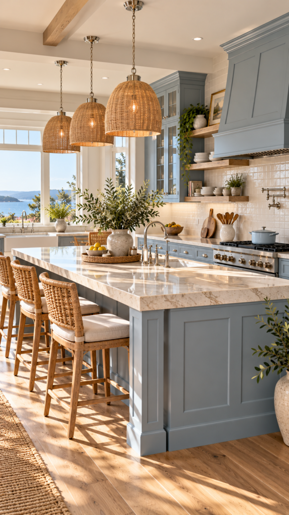
Inspired by the intersection of sea and shore, dusty blue and warm sand create a serene, airy environment. This Coastal-inspired palette feels light, optimistic, and highly approachable, making it an excellent choice for open-concept homes.
Creating a Light and Airy Flow
This pairing offers excellent flexibility for various Kitchen Design Ideas. A dusty, grey-toned blue on the cabinetry introduces color without demanding attention. The warm sand color should be brought in through architectural elements rather than paint—think wide-plank sandy oak floors, natural linen window treatments, and woven rattan bar stools.
Best Materials for This Palette
To keep the look elevated, avoid stark white countertops. Instead, choose a creamy quartzite or a light beige Caesarstone. A backsplash featuring subtly textured tiles in a sand or greige tone ties the blue cabinetry to the flooring. Polished nickel faucets and cabinet pulls provide a soft, reflective metallic finish that suits the coastal vibe better than harsh chrome.
Design Tip: To prevent a coastal kitchen from feeling thematic or cliché, avoid literal nautical decor. Rely purely on the color palette and natural textures (wood, linen, stone) to convey the seaside mood.
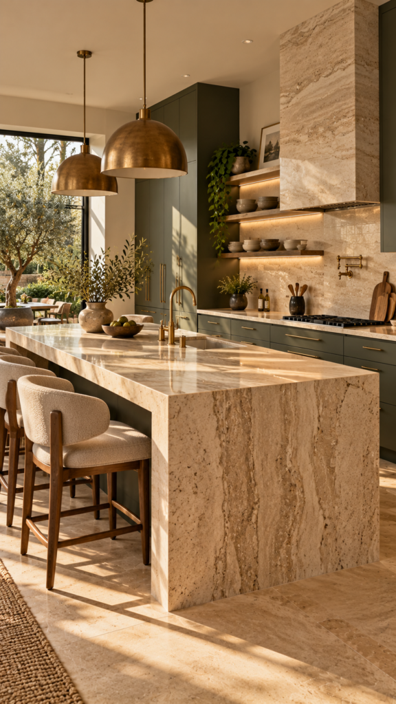
7. Olive Green and Creamy Beige (Quiet Luxury)
For a space that exudes calm and understated elegance, olive green and creamy beige fit perfectly into the “Quiet Luxury” aesthetic. This style prioritizes high-quality materials, muted tones, and a lack of visual clutter, resulting in a highly sophisticated cooking space.
The Power of Muted Tones
Unlike brighter greens, olive has distinct brown and grey undertones, making it incredibly versatile and grounded. Applying olive green to flat-panel or slim-shaker cabinets creates a rich foundation. Creamy beige on the walls and upper open shelving keeps the room feeling expansive and warm, avoiding the harshness of pure white.
Elevating the Design with Stone
This is one of the Best Colors for a Kitchen when you want to highlight natural stone. A dramatically veined travertine or a warm beige marble slab used for both the countertops and a seamless slab backsplash elevates the entire room. Complement the organic feel with oil-rubbed bronze or aged brass hardware and plumbing fixtures.
Design Tip: In a Quiet Luxury kitchen, less is more. Keep the countertops clear of small appliances and use integrated, panel-ready refrigerators and dishwashers to maintain a seamless run of olive cabinetry.
8. Charcoal Grey and Reclaimed Wood (Industrial Modern)
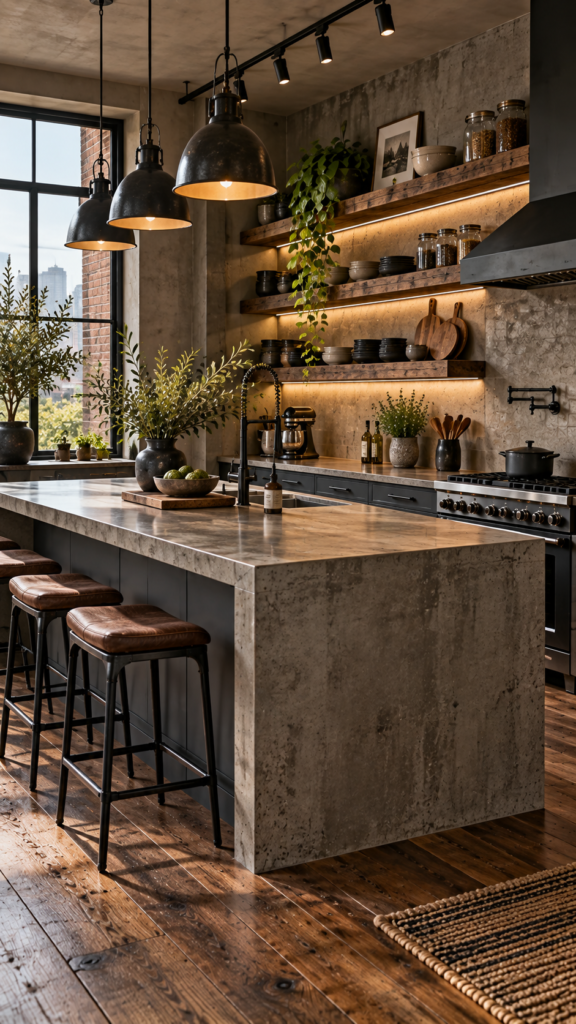
Combining dark, moody charcoal grey with the rough, varied textures of reclaimed wood creates a robust, tactile environment. This palette belongs in Industrial Modern or Mid-Century spaces, bringing depth and architectural interest to lofts, urban homes, or contemporary builds.
Anchoring with Dark Grey
Charcoal grey provides a softer, more nuanced alternative to stark black. Use it on the primary base cabinets and the kitchen island. Because charcoal is a cool, heavy tone, the upper half of the kitchen needs to breathe. Skip traditional upper cabinets entirely if storage allows, and install thick floating shelves made from reclaimed walnut or salvaged oak.
Lighting and Hardware Choices
The success of Kitchen Cabinet Color Combinations involving dark tones depends heavily on lighting. Incorporate architectural track lighting, matte black industrial sconces, or bare-bulb pendants. For countertops, honed concrete or a matte grey quartz reinforces the industrial aesthetic. Hardware should be substantial—think heavy, knurled black pulls or dark pewter knobs.
Design Tip: If an entirely charcoal kitchen feels too dark for your space, use the dark grey exclusively on a central island and use the reclaimed wood finish for the perimeter cabinetry.
9. Peach and Crisp White (Soft Contemporary)
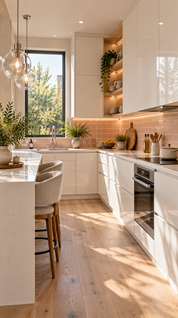
For a fresh, optimistic, and highly reflective space, a palette of soft peach and crisp white is a brilliant solution. This Soft Contemporary approach is particularly effective in small or galley kitchens, as the light tones bounce natural light around the room, helping a compact space feel more open.
How to Use Pastels Professionally
Pastels in the kitchen can easily feel dated if not handled correctly. To keep the look modern, use crisp, stark white on the primary cabinetry (preferably with a sleek, handle-less profile). Introduce the soft peach through a glass tile backsplash, the wall paint, or even a painted kitchen island. The peach should have earthy, terracotta undertones rather than sugary pink ones.
Finishing the Look
Keep the surrounding materials light and natural. White oak flooring with a matte finish pairs beautifully with peach. Use bright polished chrome or polished nickel for the faucets and cabinet hardware to add a modern, reflective sparkle. A pure white quartz countertop keeps the work surface clean and highly functional.
Design Tip: When working with white cabinetry and pastel accents, ensure your lighting is on point. Use bulbs with a color temperature around 3000K to 3500K to maintain a crisp, clean white without turning the peach tones muddy or overly yellow.
10. Taupe and Muted Teal (Traditional Heritage)
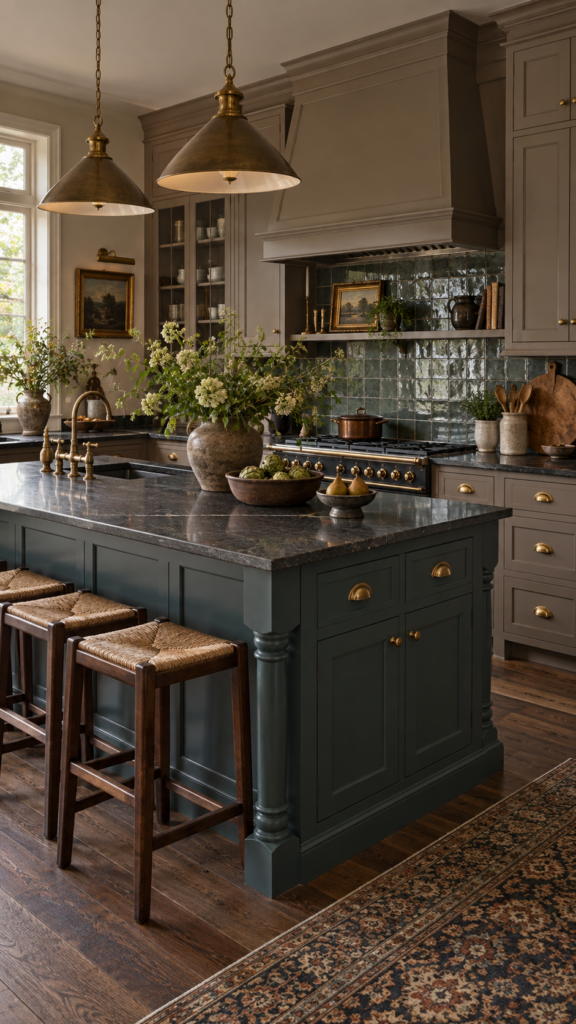
Taupe bridges the gap between grey and beige, offering a sophisticated, earthy neutral. Pairing warm taupe with a muted, historical teal creates a kitchen that feels curated, grounded, and rich with character, ideal for Traditional, Heritage, or Tudor-style homes.
Creating a Timeless Foundation
Taupe cabinetry is highly adaptable and hides everyday wear and tear better than stark white. Paint your perimeter cabinets in a rich, mushroom taupe. Use the muted teal—a color that straddles blue and green with a heavy grey undertone—on the kitchen island or a custom range hood. The contrast provides visual interest while remaining highly dignified.
Cabinet Details and Stone Pairings
This color combination shines when applied to cabinetry with historical detailing, such as inset doors or beaded face frames. Dark soapstone countertops or honed absolute black granite provide a period-appropriate work surface. Complete the traditional look with unlacquered brass cup pulls, exposed hinges, and a bridge faucet.
Design Tip: To keep a heritage-style kitchen from feeling heavy, use a highly reflective, glazed square tile for the backsplash. The gloss of the tile will bounce light around the room, contrasting beautifully with the matte taupe and teal cabinets.
How to Choose the Right Kitchen Color Combination
Selecting from the vast array of Kitchen Color Schemes requires more than just picking your favorite shade. You must evaluate the physical constraints and fixed elements of your specific room.
Evaluate Natural Light
The direction your kitchen faces drastically alters how paint colors appear. North-facing kitchens receive cooler, bluish light, which can make greys and stark whites feel chilly; warm tones like cream, terracotta, and taupe work best here. South-facing kitchens receive warm, intense sunlight throughout the day, allowing you to easily pull off cooler tones like navy, dusty blue, and charcoal.
Consider Room Size and Layout
Lighter finishes can help a compact kitchen feel more open by reflecting light, while dark colors absorb it. If you have a small kitchen but want to use dark colors, apply them only to the base cabinets to ground the room without shrinking the visual space at eye level. In large, open-plan spaces, you can use bold colors on floor-to-ceiling pantry walls to anchor the room.
Account for Existing Elements
Unless you are doing a gut renovation, your color choices must harmonize with the fixed elements remaining in the room. Look closely at the undertones of your existing flooring and adjoining rooms. If you have warm, red-toned oak floors, cooler cabinet colors like olive or navy will provide excellent contrast, whereas matching warm woods with warm cabinets can sometimes clash.
How Many Colors Should You Use in a Kitchen?
A well-designed kitchen generally relies on a palette of two to three primary colors to maintain cohesion. Designers often follow the 60-30-10 rule: 60% of the room should be a dominant color (often the cabinetry or walls), 30% a secondary color (such as the kitchen island, countertops, or flooring), and 10% an accent color (brought in through hardware, lighting fixtures, or a backsplash).
Using more than three distinct colors on large surfaces can make a kitchen feel chaotic and fragmented. If you prefer a monochromatic look, you can use varying shades of a single color alongside neutral materials like wood and stone to create subtle depth without introducing new hues.
Frequently Asked Questions
What are the most timeless kitchen color combinations?
Classic pairings like warm white and natural wood, navy blue and brass, and soft taupe with marble countertops consistently stand the test of time. These palettes are grounded in traditional design and avoid relying on fleeting micro-trends.
What colors make a small kitchen feel bigger?
Light, reflective colors like creamy whites, soft pastels (like dusty blue or peach), and warm beiges help bounce light around the room. Pairing these light cabinets with a reflective backsplash and keeping countertops clear can help a compact kitchen feel significantly more open.
Should kitchen cabinets be lighter or darker than the walls?
There is no strict rule, as both approaches work depending on the desired mood. Darker cabinets with lighter walls ground the space and are highly practical for hiding scuffs. Lighter cabinets with darker walls create a dramatic, enveloped feel that draws the eye upward.
Can you mix warm and cool colors in a kitchen?
Yes, mixing warm and cool tones is a great way to create a balanced space. For example, pairing cool navy blue cabinets with warm brass hardware and warm oak flooring prevents the room from feeling too cold or one-dimensional.
What kitchen colors work well with wood cabinets?
If you have natural wood cabinets, pair them with matte black for a modern look, sage green for an earthy, organic feel, or crisp white to keep the room feeling bright and contemporary. Always consider the undertone of the wood (warm vs. cool) when selecting a complementary color.
Final Thoughts
Finding the ideal color palette is the most impactful step in any kitchen redesign. The best choices are rarely about following the latest trend; they are about understanding how color interacts with your room’s natural light, the architectural style of your home, and the materials you choose for your countertops, flooring, and hardware.
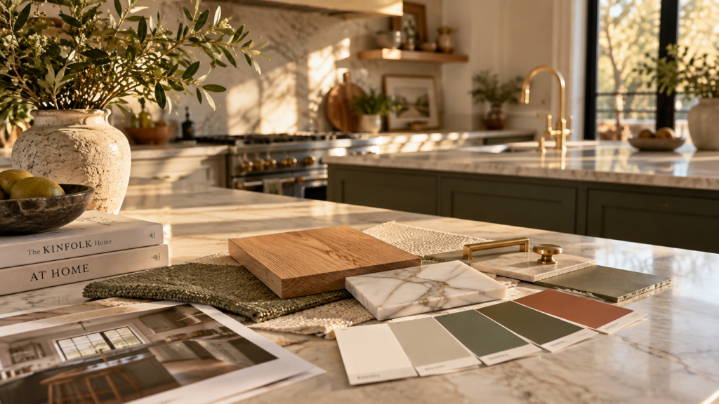
Whether you lean toward the crisp contrasts of a Japandi-inspired space or the heritage charm of taupe and teal, the key to a successful design is balance. Before committing to a full renovation, always order paint swatches and material samples. Observe how they look against each other in your kitchen during different times of the day to ensure your chosen combination is both beautiful and practical for your daily life.